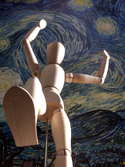
Remie, you should have seen how many I took with no background but the wall. Then my brother suggested a big sky. Well, it was night on the last day (this always happens to me!), so I grabbed the Van Gogh print off the wall and held it above the dummy. On the wide angle it was hard to fill the frame with it, but I ended up getting a crop that seemed to work ok!
very good lighting, nice cropping, nice back drop. more knee and less space at the top (a tighter crop around his hand) is the only thing i'd recommend.
Good compostion with the background. Adds emotion. For some reason I feel like a red light on the dummy would have really added to the feeling of anger or menace I get from this photo. Imagine half that model being red :-) I go to walmart for all kinds of cheap colored bulbs for light affects.
Pretty neat concept to this shot. I fear the dummy now. Nice use of light and great background. The perspective of the shot conveys the challenge topic quite well IMO.
I'm all in my tuck and ready to roll out of the way at the last second, then clamber up that pole he's got in his butt and give him a kicking. Good choice for the bg. I think a little more light back there would give the image a better tonal balance, that or toning down the sidelighting on the figure. This could really pop.
HEY!!! That's my Van Gogh. It was stolen last week, just before I was going to use it as a background for my dummy-picture. Now it get a lot of comments that my background is too plain. :-) Anyhow, what else can I say then this is a brilliant idea!!
Nice lighting. Good use of an intersting backdrop. (Go Starry Night!) Parts of the dummy seem a little blown-out (overexposed?) and the backdrop could benefit from a bit more light on it to really bring out the colors.
I like this mannequin shot a little better than the other one in this challenge. i also liek the van gogh in the background offering some decent contrast. The lighting coming from the side also enhances the dimension of the mannequin... good job!
I had a feeling that there would be more pictures in this style, because it has such a fun appeal to it. There weren't, so that makes your stands out more, especially since it is so well done. The starry night background is fantastic and very fitting. The lighting on the subject is well-done, in that it fits the theme of the picture, but somehow it seems distracting. Maybe it's because the light is too intense on his right arm where it bleaches out the image. I would have given this picture another point if you had gotten the foot in stronger focus, and dropped the lighting just a notch. Aside from that, great job.
I like the dummy, and the background works well. It looks like window lighting? The highlights are a little overexposed, maybe you could have decreased the exposure a stop or so?






 Add photograph to your favorites
 Add photographer to your favorites


 Photographer found comment helpful.


