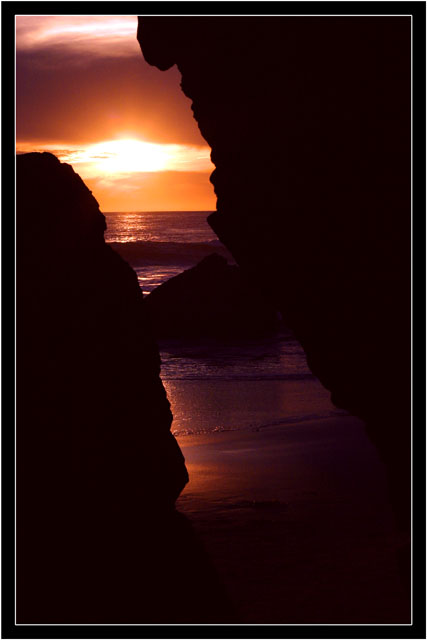
First I think the borders are a bit of overkill. Nice compositional idea, but I don't think you need quite so much rock in the frame. Finally I might have stopped down a tad to darken the colors and possibly get a little more detail in the sun. This is a lovely photo with a lot of potential in my opinion.
i think this visit has a lot of potential, but i feel this image doesn't quite achieve it, at least for me. the darkness of the crevice is a bit too pronounced, and the sun a bit too overblown. the colors and angle works, but the border is too overdone. good luck with the rest of the voters, this will get a 5 from me.
Ohmygoodness. . . .this is gorgeous! I can just see an inspirational writing along the right side, and this framed into a beautiful matted wall print . . . or on 2nd thought, forget the inspirational writing -- the picture stands by itself and doesn't need ANYTHING. 10
Beautiful sunset. I like the colors on the water and wet sand. I wish there was some detail in the rocks in the fg. They are very dark and are a bit too 'heavy' for me.







 Add photograph to your favorites
 Add photographer to your favorites


 Photographer found comment helpful.


