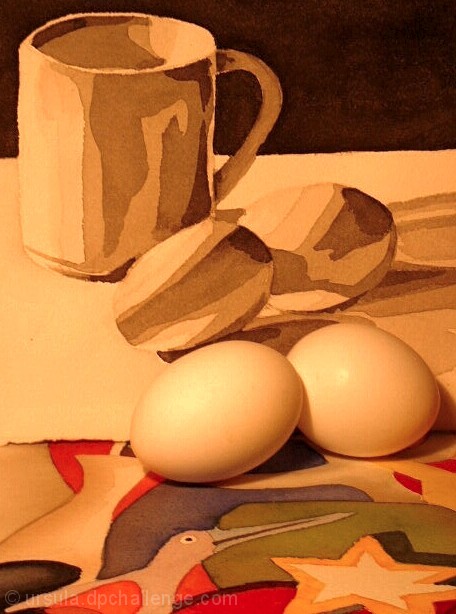
An interesting and appropriate stylistic choice to have the eggs the same colors and tones at the illustrations behind them. Even harsher light and being more in focus would, I feel, increase the effectiveness and "illustrated" quality you were trying for here.
maybe the lighting is creating the poor contrast between the eggs and the background here... i'm not sure if that was intentional or not, but I would personally like this one better if the eggs stood out against that a little more... - setzler








 Add photograph to your favorites
 Add photographer to your favorites


 Photographer found comment helpful.


