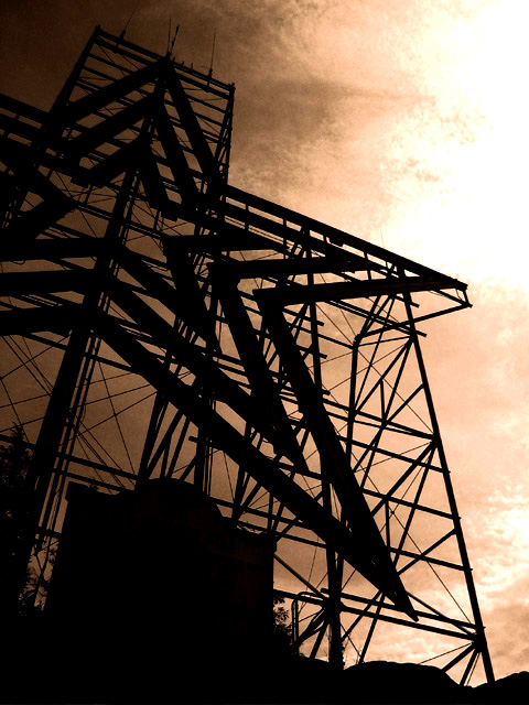
I love architectural photos and the sepia tones really played this one up. Good call! Usually I like B&W for the stark contrast but in this case the color added alot. I see movement in the clouds and I really like it. Makes me think of a man-made comet.
Thanks for voting and taking time to make comments!
The blown out sky was intentional. I had this shot as a color shot...then moved it to black and white because the sky detail wasnt good enough for color. Black and white mad eht photo look like a file photo fo a newspaper..pissem me off and I went for a hue shift to a more sepia.
As I did this the sky became more blown and detailed, the image went more silohuette and my eye stayed with the image longer. I lost the sign in the front of the Roanoke Star describing its history. That was something I needed for an article I am writing. I am adding that element back in photoshop for the shot in my article but., becasue we can't do that for the contest rules I left the sign blank ( which seemed to bother a couple folks but..thats life :-)
Good stuff! I'm not wild about how the detail is lost in the ULHC, but that's fixable. This up on a mountaintop somewhere? Fantastic angles, and I really like the sepia treatment.
This is one of my favorite photos in this challenge. i can't say that i would have done anything differently than you have done here... I love the sepia tone.. it adds quite a bit to the mood of this photo. Nice job!
This is a very cool photo, great colours and lighting, the silhouette is very effective. The complexity of this structure provides a lot of interesting shapes and lines. I think experimenting with framing it and cropping it differently might have yielded something even more exciting though.
You did a good job here of capturing a "simple" image. You have two colors, basically - sepia toned sky, and completely shadowed machinery. I'm having some trouble with the sun coming through the clouded sky, though... it looks somewhat bleached or washed out because of your coloring scheme. I'm also not sure the horizontal angle works so well for this picture. It might have come across better if you got closer to the picture and looked more upward (that star pattern really accentuates the up). Then again, because of the simple style, it's hard to tell how close you are or are not. Maybe you are as close as you can get. A nice effort :)






 Add photograph to your favorites
 Add photographer to your favorites


