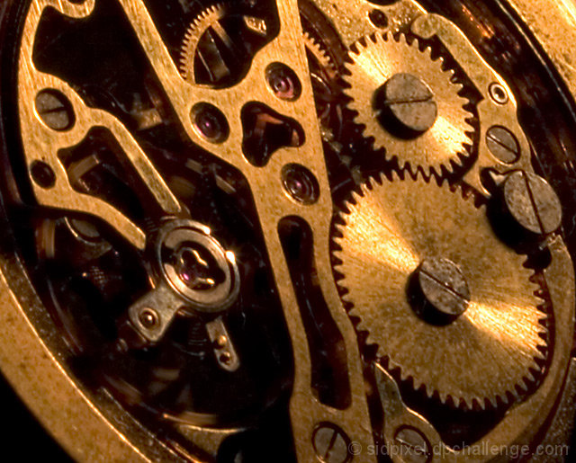
many thanks for your comments, folks. Believe it or not I did not want a too sharp image I wanted to try and emphasize a bit of antiquity (even though its a modern watch). I was obviously not too successful but its all part of the learning process.
Nice view of the movement on this watch. Three things which could be improved upon: Sharpness, Lighting, Color.
Not sure if the fuzziness is due to limitations of your camera's imager, camera shake, or if was just simply off focus. In any case, I would recommend taking a few extra shots on a tripod or on a stable surface to try to get it sharper.
Getting adequate lighting on jewelry and small items as this watch is quite a challenge. Appears to be shot with available light coming in from the top right. The rotation of the balance wheel and inner mechanisms such as the escapement is obscured by strong shadows. I recommend using a diffuse ilght source normal to the face of the watch.
The color in this photograph is rather flat. It's uncertain as to whether the bridges and mainspring barrel are copper in color or if it's skewed white balance. This is tied with the choice of lighting and would probably correct itself once improved.







 Add photograph to your favorites
 Add photographer to your favorites


 Photographer found comment helpful.


