White balance looks off. Composition not too appealing... Put more thought into the challenges... I know it can be hard sometimes, but think about it more before you just grab the first thing in your house and shoot it.
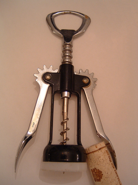
A nice idea. Good subject that fits the challenge nicely. I don't like how the cork is cut off though, and the corkscrew looks slightly tilted. I think it might be better if it were either truly diagonal or evenly straight. Lighting looks kind of flat overall except for the hot glare on the left arm of the tool.
This just doesn't have anything going for it other than a "mechanical device"; the composition is awkward, the background comes across muddy, I donno... Be nicer maybe if the corkscrew ere protruding a but through the bottom ring. Maybe witht he cork still appended to it? It's just static to my eye.
You should have shown the corkscrew in action, it would have been more interesting. The picture looks to flat, there's nothing really interesting in it. You had a good idea with setting the cork and the screw up in a way that one's protecting the other, but it doesn't add to the challenge theme. 3.





 Add photograph to your favorites
 Add photographer to your favorites


 Photographer found comment helpful.


