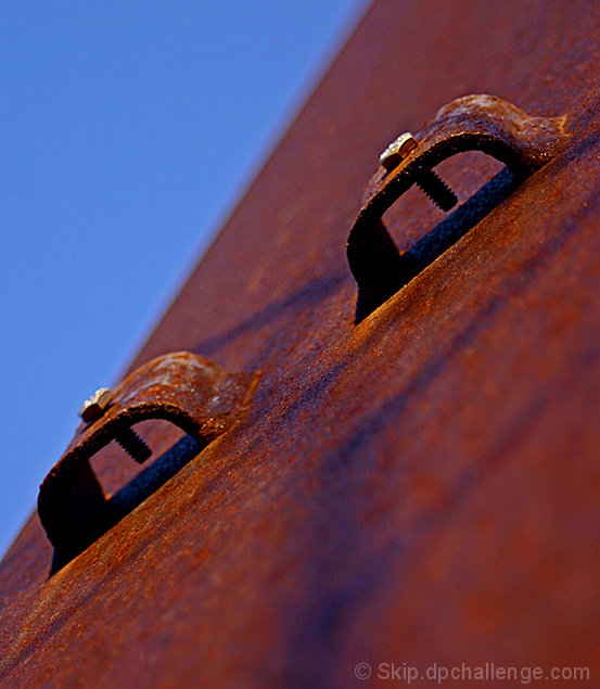
You've certainly got an eye for the dramatic abstract.
The blue and red work well against each other, with the dyanmic angles and the back and forth between the colours.
Might like it more if the left most bolt/ raised part wasn't cutting slightly in to the blue - it needs to be a bit more decisive, either cutting in totally, or not at all (reminicent of portrait photography, where you don't want the nose half cutting the cheek line)
Might have backed off a bit on the red saturation, but it can be addictive.
Interesting, simple, and creative. I like the composition of blue and brown. The structure seems to have a halo along the blue, but its not too distracting. Not sure if it could be cleaned up or not.






 Add photograph to your favorites
 Add photographer to your favorites

 Photographer found comment helpful.


