Critique Club Comments by Grayce
I like this very much. Pine cones always appeal to me and you did a nice job capturing this image.
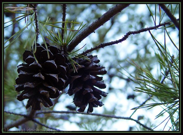
The composition is good, and it's nice you didn't center the pine cones. The way you cropped works well, that you included some pine needles in focus and the diagonal branches leading the eye to the cones.
It's a simple picture, which adds to the appeal. The little bit of green makes it fresh and refreshing. There is a hint of texture on the branches. That's nice.
There is nothing I don't like here, except maybe brighten the pine cones a little, but it is acceptable. So what more can I say? Good job!
Regards,
I like how you've used shadow to create focus on your subject: the pine cones. The theme of the challenge is wide enough to include this photo, and I really enjoy the varied textures created through blur and sharpness.
IMO your picture is quite busy and the main subject is under exposed. I would like to see more detail of the cones and not have the sky blaring at the viewer. A difficult task to correct but maybe you could have achieved about the same effect by taking the picture with the sun behind you instead of the subject. 5
I don't like the pinecones that underexposed. They lack color, not that they're jumping with vivid color to begin with, but I think they should look at least like wood. Great DOF on this shot.
Good use of the rule-of-thirds concept. I think the cones are just a little dark compared to the sky but I could see this used in a textbook or along with a magazine editorial piece.









 Add photograph to your favorites
 Add photographer to your favorites

 Photographer found comment helpful.


