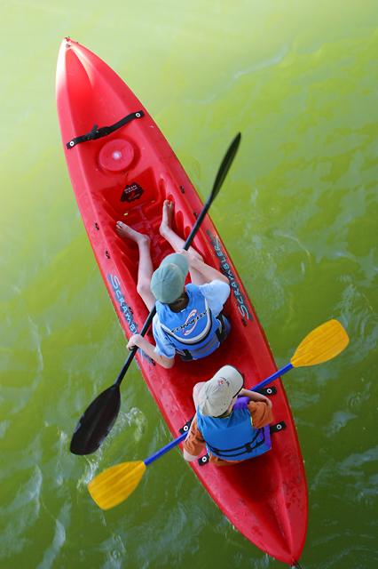
Composition - Yet another great picture Gordon. Framing is very good. I like the corner to corner approach. I think if the heads and paddles were at the same angle, you might've won this week. The contrast between background and subject is really good and the green of the water really makes the red on the boat stand out. The water in itself is neat the way it accepts the sun on the top left and makes the frame sort of a gradient. Doesn't look like anywhere I'd want to swim though due to the odd color.
Technical - Crisp and mostly clear, only a slight fuzz on the paddles probably due to them rowing which is sort of the whole point of why they're out there so its an acceptable fuzz in my book. The exposure is perfect. The only thing I wonder about is if you cropped this pic that close to the back on purpose or if it was just taken this way. I don't see it being a huge problem, but if the back had a little more room I think it would only help.
Overall - A great example of how to take something not so exciting and transforming into a nice image. Very good capture. I really like the contrasting colors and the corner to corner portrayal of the boat in the frame. Very good shot! - Keep up the good work Gordon.
Neat camera angle. I love the composition of this. Somehow the water seems like a very icky shade of green, and perhaps it's a little underexposed judging by the brightness of the colours despite low tonal depth. However, on the whole I like this photo.
Congrats on my highest rated photo of the challenge. 10 - The color is brilliant. Just a tad of blur on the oar showing motion, but I’m not sure the blur adds anything for me on this shot. The crop is crowding the bottom of the shot. In a perfect world I would probably have centered the boat in the frame, but I have no idea if the crop is trying to hide something undesirable behind the boat. All in all a great shot, I can see this showing up in many sports clothing magazines.





 Add photograph to your favorites
 Add photographer to your favorites

 Photographer found comment helpful.


