greetings from the CC,
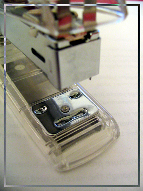
My criticism would be of the border I find it distracting to the image. I also think a slightly tighter crop on the top may have helped to focus the eye a bit more to the 'face'. Nice use of diagonal line.
Would be curious how it would look on black background to make a more dramatic feel.
just my thoughts
lynn
Cool face--looks like it's bracing for the next impact. Interesting frame effect, and am curious how it is achieved....Unfortunately, it detracts interest from the subject. Yes, it needed a frame to contain it, just not sure this one's the right one. I note a second face above--the happy part with red eyes that's ready to hammer the one below....
I would score a point higher, but the border is distracting and draws attention away from an otherwise very nice compoxition! Oh and the letters on the back side of the paper are distracting also...
TC
Good idea and composition. I don't really care that much for the border, I don't mind the concept of the border, but I don't like the color or effect it has. Seems to distract from the shot.
I like this, but I think if you'd have cropped off the very top where the clear case is out of focus, it might have looked better. Also, the border is a bit distracting for me, but I know that this is one of those hotly debated issues, so I won't mark you down on that :)
So I'm not the only one who's the clown's face since I was a kid! Nice, a bit too dark. Focal lenght would work better if it would catch the whole picture in focus.





 Add photograph to your favorites
 Add photographer to your favorites


 Photographer found comment helpful.


