Author Thread
Post actions
this is one of the most underrated entries in the challenge :(
Comments Made During the Challenge
Post actions
Post actions
I think this misses the point of the challenge...unless I'm missing a "hidden face"?
Post actions
Really nice shot.
Post actions
Nice job. Tough lighting.
Post actions
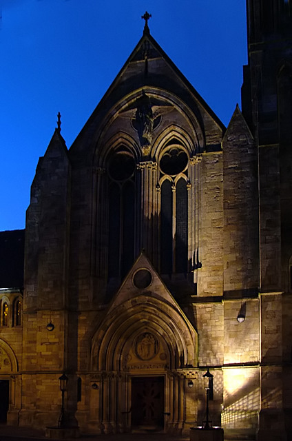
Devilish! Wonderful portrait with a gothic theme.
Post actions
Would work a lot better if you could coax some detail out of the second "eye"...
Post actions
A face, all right. Well seen. God??? Interesting choice of names. Bet it gets some comments.
Post actions
God is certainly not very happy. I like your different approach.
Post actions
god looks like he is not too happy with us
Post actions
Nice. It's a shame that so much of the facade is in shadow, but I'm not sure how you would have avoided that.
Post actions
This is one of my top three for this challenge. Beautiful architecture. A few spots in the upper left corner you might clean up. Great shot!
Post actions
Excellent lighting and shadows, and the sky seems vibrant. Can't decide whether I would have cropped the lower third off to get rid of the light and grid shadow. I guess I'd have to try and see if it made a significant difference.
Post actions
what a powerful entry! easily a top-10. great job!
Post actions
Post actions
No wonder kids don't like going to church, look how scary it looks! Very pretty, just ominous. Great lighting, obviously fits the challenge, 9.
Post actions
Post actions
This is a great spot. Really nice. For me, I would have liked to see more of the 'eye' on the left, it is a little too much in the shade.






 Add photograph to your favorites
 Add photographer to your favorites

 Photographer found comment helpful.


