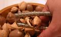
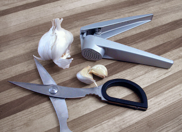
Shot with diffused skylight, no artificial light, hand held and manually focused.
Every element has its own selection mask. Objects have small changes in hue/saturation and levels. Cutting board desaturated significantly and very slight gaussian blur applied.
Statistics
Place: 165 out of 243 Avg (all users): 4.7885 Avg (commenters): 5.6667 Avg (participants): 4.6273 Avg (non-participants): 4.9067 Views since voting: 1825 Views during voting: 318 Votes: 260 Comments: 9 Favorites: 0
Initial thoughts Composition lacks coherence, background conflicts with main content.
Composition/ Content The content itself seems a strange choice. I like the idea of showing the garlic press and the garlic together but can't quite fathom where the scissors come in. Together they seem a little too random and unconnected.
Compositionally, the layout doesn't feel balanced. There's no flow in terms of natural eye movement around the image; my focus is stuck on the reflection on the garlic press; the lower right area of the frame feels oddly empty even though that corner is no different to the other corners. I think that's all down to the rather random layout.
Whilst I often find it works to crop part of the contents out of the frame it doesn't seem to work here – perhaps because it's only happening to one item and only at one edge of the image.
Coming back to content, I think it's important not only to find subject matter that fits the challenge theme but also to present it in such a way that it's aesthetically appealing or intellectually interesting.
Background The wooden chopping board that you have used as your background seems at odds with the main content not only in colour but also in texture and in the shapes it provides. I find the strong parallel lines too overpowering for the contents placed on top of them.
Camera Work - Technical Lighting and focus look OK but there is a patch of the garlic bulb that seems blown out.
Fits The Challenge Yes.
My Opinion On The Photo Too much concentration on meeting the challenge and not as much on producing an image that's appealing in it's own right.
There are a couple items about this image that could use some extra thought. First of all, the choice of the wooden cutting board as a background for this still life may not have been the best one. The diagonals are nice in the composition, but the color or the background doesn't mesh well with the subject. The composition also feels a little uncomfortable with the handle of the scissors missing in the frame. That compositional item seems to break the rhythm within the image. I'm bad about saying this, but I believe this composition would be stronger as a black and white also. That would eliminate the color conflict. There is 'conflict' within the color structure here because your tools have a cool metal color and the board has a warmer feel to it.





 Add photograph to your favorites
 Add photographer to your favorites

 Photographer found comment helpful.


