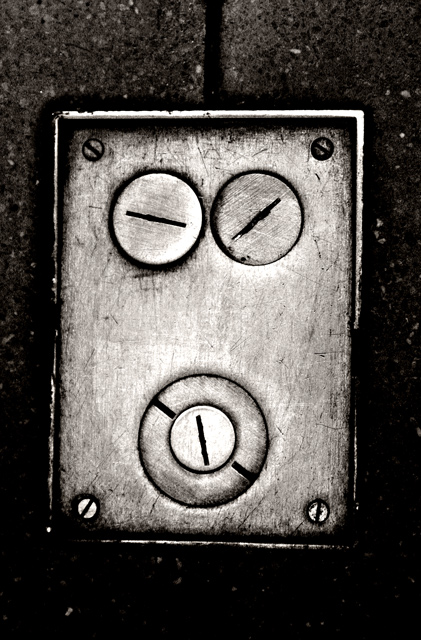
This is great! I missed it during the challenge, but congrats on your placement. Excellent textures and contrast. I like how it gets darker at the bottom, really makes the box stand out. Very good composition.
When I saw it, it reminded me of that swf that was floating around a couple years back. "Combo #5" with the two cartoon asian guys singing about the combo meal!? Very funny. (: Let me know if you've never seen it, its hilarious and I think I have a copy around somewhere.
Had another look on it and smiled again! It is very funny how the world around is looking at us...
And congrats on your 8th place!
...edit: went to my favourites ;-)
This is a beautiful image and well deserves it's high finish in the challenge. The "face" itself is almost startlingly whimiscal and appealing.
Looking at it as a B/W print, I see a lack of detail in the darkest areas that might profitably be fixed, if the information is in the exposure. Speaking in zone system terms, you have a lot of "zone 2" areas that could be raised to "zone 3" (the zone of minimal shadow detail) to the enhancement of the image. this is particularly true where the cover plate falls off into the background in the lower corners and on the right edge a thrid of the way up. A hint of separation of plate from BG would be a plus in these spots.
Otherwise, the tonalities on the plate itself are wonderfully rich and tactile.
From a compositional perspective, I think it's a little TOO balanced top-and-bottom. I'd prefer to see a smifgen removed from the top and added to the bottom, in much the same way that we matte prints with a bit more space below than above.
Wow! My first time scoring over six in two consecutive challenges... Thanks you guys --- cudn't have dont it without ya! (really!)
Also, glad to finish in eigth place for the second time... this is also my second Top 10 finish. Thanks for all of the 29 comments (yowza!) and all the helpful feedback...
Very good submission for me, perfectly fitting into the 'hidden faces' theme and genre. Title: "I'm Going Slightly Mad" excellent telling wording for the photo! Excellent!
Composition and idea: Very good seen and with retouche a good composition made out of it. Very helpful the B/W toning, reducing distracting 'sides' outside the 'face' itself, BG etc.
The position of the 'eyes' screws are perfect and i am also absolutely pleased with the 'mouth' screws too. So also very good abstracted, to say a playful incarnation of forms, cirlces and squares. Additionally the 'light' decrease from above towards the bottom implies the 'going mad' - Hello :)) would rate it very good work!
Extremely funny. I think a tighter crop would do it better. And slightly rotated .... Very expesive and good title. Even if there are some other (few) better entries on the challenge I feel likr bumping up to 8. Good luck
To me, this is the kind of image that the Challenge was crying out for.
Suits the high contrast treatment (although that may not be to everyone`s liking.)
Good luck.
lol, great title. i love the tonal contrast and texture here.. i think the choice to use b&w was probably a very good one. wish it was maybe slightly more straight on, but what's a person gonna do.





 Add photograph to your favorites
 Add photographer to your favorites

 Photographer found comment helpful.


