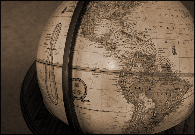
The composition of this seems awkward, and there isn't enough contrast. Everything seems washed out and dull, so it's hard to make out the details of the map on the globe.
I like the sepia tone. The harsh shadow on the lower left side of the globe kind of distracts me a little. Not crazy about the composition, though I honestly couldn't say how I might have done it differently - it just feels..."odd", to me.
Hmm good idea, but a few problems... First, the frame that holds the globe is right in the middle of the pict. It should be invisible or maybe off a lot more to one side. The lighting is too weak. Need brighter lights. The shadow and carpet on the left is also a little distracting.
This globe looks a little squished, which may be because of your crop. I wish that either the globe was a bit brighter or the background a bit darker, as I think there needs to be more contrast there. Good shot, though.
I would think that this would sell over and over again for illustrations ... textbooks, annual reports (probably better in color for that purpose), possibly magazine articles. Don't see this as a magazine cover image though because it isn't vertical and there isn't enough room to make it vertical while leaving room for a magazine masthead ... but that could be another photo in your stock library.
This is an excellent stock photo... it's not loud with color and it could be used to support a great number of themes.... great idea and excellent execution :) - setzler
A good image, but the reflection on the middle of the globe makes it look as if you used a flash. Flashes are bad. Use a diffused light source, preferrably from one or more of the sides, to give it a rounder feel. Nice shot and subtle sepiatoning though. (8)






 Add photograph to your favorites
 Add photographer to your favorites


 Photographer found comment helpful.


