well, well, well. I wasn't going to submit anything, but at the last minute decided to go with this concept. I'm a strong believer in the law of averages. The way I see it, if I get a 3 average this week, I'll get a 7 average next week. Let's see if it works.
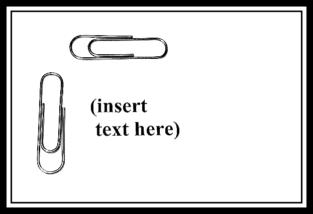
All week I was trying to frame subjects and was thinking ... gotta leave some room for text. So I did. :)
Statistics
Place: 82 out of 90 Avg (all users): 4.8936 Avg (commenters): 4.7273 Avg (participants): 4.7903 Avg (non-participants): 5.0938 Views since voting: 2074 Votes: 94 Comments: 13 Favorites: 0
(1) COMPOSITION (CONTENT) This is a very simple photograph. The absolute simplicity of the photograph is its real strength. The composition is probaby the best possible with such props as you have chosen to use. The addition of the text is very important here, as the photograph without that would be too stark.
(2) BACKGROUND I realy have nothing I can add about the lack of background. The white sets off the paperclips well.
(3) CAMERA WORK ,TECHNICAL The DOF is very good, all of the important parts are in sharp focus.
(4) DIGITAL PROCESSING ,TECHNICAL Your post processing is good. Good use of black and white. I do feel that perhaps you have oversharpened a bit because the paperclips seem a bit "off".
(5)MEETING THE CHALLENGE You have done a good job of meeting the challenge in an original way.
(6) MY OPINION ON THE PHOTO The subject here is perhaps a bit oversimplified. The way you executed it is alright. There is not a whole lot here to hold my interest for very long. I am glad to see that you did not spend much time on it.
Office Max here we come. I see that your shot must have been directed to the advertisement sector, and I am sure there would be some industry that might be interested. It is however kind of stark and low on the interest factor. 5
This is definitely stock photography, but it doesn't look like alot of thought or planning went into it. I'm not being negative, it just seems a little too simple. Just a thought, still a good photo.
This is an original idea! Maybe if you hadn't put the writing in the middle and only had the two paperclips there it could have had much more impact. I feel the writing spoils this image but that is only my opinion. Good luck anyway.
As a photo buyer, I wouldn't want to see the text you've added. I know where I want to put text; you don't have to tell me. The border doesn't add anything and if I were laying out a magazine or annual report or textbook, I'd probably crop those out anyway. You've got a good concept here for a stock photo and the paper clips are quite sharp and well lit.
Nice pun in the title. Even if this was photographed, though, it's really more graphic art than photography in my opinion. I still applaud your creativity.






 Add photograph to your favorites
 Add photographer to your favorites

 Photographer found comment helpful.


