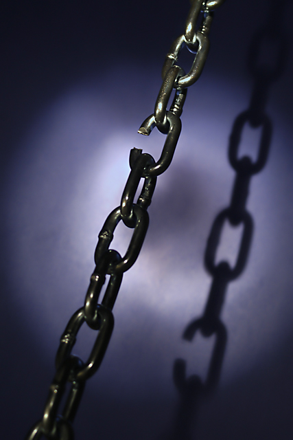
Composition: In general the composition is very good. I might have tried changing the cropping to have the broken link further into the top left corner, and the shadow in the bottom right corner. This would involve re-framing the chain then moving the light to compensate.
Technical Quality: The shallow depth of field works very well to help blurthe shadow, but unfortunately it also blurs the chain at the bottom. Perhaps you could reposition the chain slightly to keep all of it in focus? The lighting is good, but the bottom part of the broken link is too dark to see it properly - the top half of this link is great though. I might have considered having the chain just a little brighter so that it really grabs attention.
Meeting Challenge: You met the challenge well. I could see this image even being used as a book cover, with white text in the darker parts of the image. It's a simple image which conveys a well used phrase - well done.
Creativity: I like your concept for lighting, except as mentioned above. The shadow really helps this image a lot.
Border: No border provided - no border required... Good choice.
Overall: It's a very good image, as reflected by it's sixth place in the rankings. In terms of elements to improve (since you asked specifically for what is wrong) I would say:
* Focus on bottom half of chain
* Darkness on bottom of broken link
* Small amount of "blown highlights" on some links, but nothing major
* Chain a little too dark to grab attention
Good work on a great piece of stock photography though.
COMPOSITION/CONTENT : Very nice composition. I like the mix of 'abstract' and 'reality', the graphical aspect of the pictures with it's shapes and textures and lights and the 'reality' .. it's still a chain , we do not know what it's used for . .but it's a chain with its connotation.
BACKGROUND: The circle of light is part of the back ground for me and a very nice way to 'position' the chain in space/3D and within the picture. In Addition to bring the shadow that balances the content.
TECHNICAL : Nothing special in term of exposure and Depth of field .. is it on purpose that the upper part of the chain is in focus and not the bottom ? The eyd has a tendancy I think to follow the chain and go there and leave the picture ... sort of ;-)
DIGITAL : Digital processing not very visible, just some sharpening artefacts on the side of the 'links', but not a lot (it does not 'jump at your face')
PERSONAL OPINION : I like this picture and would have been myself happy to take a picture like that. Very good work .. keep the faith and take pictures !!! Oh and by the way .. to me it meets the challenge
Thanks to all who commented and voted. I learned something from each of the comments and I do appreciate them! I enjoyed making and sharing this image. My camera is in the shop for the next couple of weeks (for a through cleaning) but I'll be back in the challenges as soon as possible.
Your 6th place is not enough to me. Your submission was the best of the week in my opinion (though is only one's oppinion). Is a very good shot (colour, composition, light...) and also has a lot to communicate. For exemple, about today's break in the world?.Meets perfectly the challenge.
DPC is very good in a lot of ways. One way is because we can see pictures like yours. But in other ways, is a little bit dissapoinment with some results. Although, that's the real life. Isn't?.
Keep on rockin!
The angle of your shot causes the broken link in the shadow to be low in the shot, wiht the actual link being high in the shot. In my opinion, that's what makes this shot great! I think this is a great concept and your composition and angle are perfect. The background is a little bit mottled and murky. A tiny bit more light on the lower part of the chain would have been nice. 8 Nice shot and good luck in the challenge,
JD ANderson
Illustrates a concept quite well, and would be useful in a lot of stock photography applications. However, the lighting doesn't quite seem right to me. It's too dark, and the spot on the background seems dirty, in a way.
I like the bright spots on this one, it helps show the stark presents of the chain. It looks to me that your focus is a little soft for the effect you were trying to get. 7
Choice stock photo, it could be used for many occasions. It is exactly the kind of photo you would see in brochures and presentations. The title fits well, and the fact you didn't put a border on this image was a good decision. 8 from me.
I really think this would be excellent as a stock photo. The diagonal composition is good, and I like the shadow. The simple background works really well too. 10
It looks like you were trying to put the light on the weak link, but it's not strong enough... Should have BLASTED it with light. Cool idea however, I like it.
Good stock image, vertical (good for editorial use, which is where most of the stock is used), good colour and contrast. The only thing I would change, is remove the shadow; it takes way from negative space which is very valuable in stock.






 Add photograph to your favorites
 Add photographer to your favorites

 Photographer found comment helpful.


