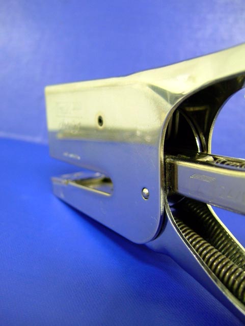
This image was a great entry to hidden faces. The compostion is bang on with the contrasting blue backgrounds. The reflection on the stapler gives it a feeling of the shark lurking just above the water. Your angle on the subject also leads those viewing the image to wonder where is he going or better yet, what prey has he set his sights on.
Back to the backgrounds. I really like the effect. The blue for the water is a nice strong colour while the blue in the sky provides a nice contrast and the lighting gives the effects of clouds, which in my mind improves this image.
Now to the camera work. Unfortunately, I am not gonna tell you anything that already hasn't been said by other comments. Your shallow depth of field (DOF) "wounds" this image as the viewer is first drawn to the end (camera focal point)of the stapler and not to the head. If you were able focus and capture the head, this image would have probably scored in the top 15.
I understand your response to the lettering on the sharks head, and we can never please everyone, and you may be right in it taking a way from the illusion. With the challenge being Hidden faces, some may have looked at those markings as the sharks "battle scars" and simply could have added to the illusion.
Nonetheless, I think this was a great entry in the spirit of this challenge.
I think you were unlucky in this challenge. The shallow DOF really hurt the voting by the looks of it. Perhaps a focused head would have been the way to go?
Perhaps lighting could have been used to avoid accentuating the writing on the side?
It was a great find.... Perhaps you can use it again for the 'Movie Title' challenge.... Title 'Jaws' :-)
everybody thank u for ur mostly flattering inspiring comments
i agree the picture deserves it..hehe
as there were a mass of remarks about the dof i just want to share this thought about it
i really considered the head being out of focus but if i put it in focus the lettering on the stapler saying in big text RAPID, made in Sweden, serialnumber, prob would have attract alot of attention
i dont think it very typical for a fish to have a brandname and stuff tatoed on his head
so if i had put the focus there it would have been a better photo of a stapler and a worse attempt to create the illusion of a shark or whatever fish
ofcourse this is just my humble personal contemplation about the subject
Very neat idea...but focus really hurts this one. Assume you used smallest aperture and focused toward the end rather than the middle. Wish I had thought of this one though!
I would have liked to see it focused more on the "face". Like this the eye is captured by the spring detail, loosing the main point of the challenge. Lightning and backgrouns clolour (too noisy)are not great either.





 Add photograph to your favorites
 Add photographer to your favorites

 Photographer found comment helpful.


