This was my favorite from the challenge - I only gave one ten. I think it faltered in the placing because it didn't fit peoples preconcieved notion of stock. None the less it is a beautiful photo... and yes, it is more "emotive" - a step away from your tightly controlled work. VERY nice use of color.
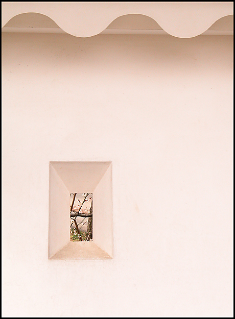
Goody for getting one of my favorites of the week! Well, let me tell you what I thought of this. I can say I absolutely loved it. It is very very simple, and very effective. The lighting is perfect, the white isn't too bright, and the twigs in the background are nicely in focus. I think maybe it would look better without the curvy lines at the top. It would then be a complete study of negative space, which is not what you were aiming for. This could be used for various magazines, including architecture, real estate, nature, etc.
Well done!
-Annida
Neat. I'm not sure it qualifies for "stock photography", but as a free study photo it is cool and unusual. Nice colours, and I enjoy the sense of mystery created by all that negative space.
Oh, this shot is incredible ... I love the soft colors, the curves at the top and then the tiny window in the thick wall, placed just right ... you might just have a winner here :)
The one thing that caught my eye with your image is the fact that it's not overloaded with colour. It's plain and simple yet effective. I love the colour and the contrast between the waves at the top verses the rectangle at the bottom. Nice and pleasing to the eye. Excellent composition as well. Great job and very artistic. GL.







 Add photograph to your favorites
 Add photographer to your favorites

 Photographer found comment helpful.


