Fits The Challenge-YES
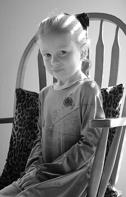
Composition-Perfect light, chair, bow, young girl.
Background-Good, yes, I guess a drape would of been better, but I do like the wall. I like the lighting on her hair, but agree the pillow could go. Still I understand !
My Opinion-Nice photo of a darling young lady doing a good job. SHE is perfect for this 'stock' shot. Your b&w tones are extremely nice.
great shot, but yeah, 'i see dead people'. bit of a creepy look on her face! the first thing i thought when i saw it was that it might be better if she was facing to the right...reading right to left generally works better for most of us.
This is cute. She looks like such a sweet little lady. The odd thing is the stripes in her hair. Is it light and shadow. Positioning her somewhere else might eliminate that. The chair goes well though, so keep that.
Maybe I'm weird, but there's something scary about this girl! She seems like one of those telepathic children in that old British sci-fi movie... I think it's because the lighting is dramatic and eerie, her pose seems too stiff, and you used black and white.
You have a wonderful subject, and it looks as though she wants you to get a great picture also. I think it is a little flat and could have the contrast bumped up a bit, but the worst problem is your light. The blaring light from the window shades is very distracting, you might have hung a white sheet over the to diffuse the light to give you a much better result. 6
Yes, I could definitely see this as a frame insert. The print of the pillow is a bit distracting, though, and rather conflicts with the demure expression and posture of this child. The sunlight in her hair is lovely.
Challenge met, I could almost see this as a frame insert. B&w is often used for those, and it works well here. You've achieved a nice tonal range, although just a tad more contrast would've been nice, too. Two things to consider are (a) the pillow ... I think a more simple pattern or even a single color would've been nice and (b) have the girl smile and raise her head a little bit. I shouldn't give you advice, I don't even attempt portrait photography (my one attempt in the b&w portrait challenge was my worst score ever), but I'm telling you that, from a viewer's point of view, these things would improve the photo. She is a cutie, btw. :) Also, I wonder if you are getting comments about the shadow/light stripes on her hair ... personally, I think they add to the photo.
Cool! I love this photo, one of my favourites this week. The light playing in her hair is amazing. The crop is great, it just goes to show you that you don't always have to crop a person at the waist or knees right. I hope you gave her some candy for modelling so well, or you ate it yourself didn't you! 9 from me if you gave her the candy :-)
She doesn't look to happy to be there. Neat lighting and I like the chair effect. The light looks a little bright as its washing her hair out. The crop could be better IMO including the whole chair but isn't necessary.
This is a nice portrait. I'm not sure if it would be stuck in a photo frame, though - they always seem to smile in photo frames. Also, the lighting on her hair gives her kind of an alien feel. Still, good shot.






 Add photograph to your favorites
 Add photographer to your favorites

 Photographer found comment helpful.


