Critique Club Comments by Grayce
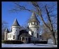
The coloring here is brilliant. That sky is just perfect. I love the lighting on the tree branches. It shows some texture. As for your cropping, it would have been better to see the tips of the branches. The composition is too tight to accomodate any text that a stock agency would look for.
Overall a pretty picture but lacking "WOW" factor.
Good luck on future challenges.
Regards,
The contrast between the tree and sky is amazing, and you got the image so sharp, good one! The only thing I find distracting is the crop. I would have liked to have seen the tree fully in at least one direction. You got the tree cropped from the sides and the top, like a hand with no fingers. But it is a good stock photo for sure.
Very nice! I am drawn to "snag shots". Very good color and focus. Framing - I don't know everything, but limbs coming into the frame from other than the bottom leave me wanting. (Don't worry, it's more of a nit than anything.) 8 Swash
Excellent example of a stock image. It has mood, quality, and is relatively not busy wich make it usefull for both editorial and billboard advertisement. If it was cropped so that some of the branches in the upper right conner were cut off, would be a 10.
Not sure how you managed this. It appears to be the middle of the day but the lighting on the tree looks like something you would see at nighttime. The colors are great for this shot and it looks amazing. 10! - xertion






 Add photograph to your favorites
 Add photographer to your favorites


