-General comments
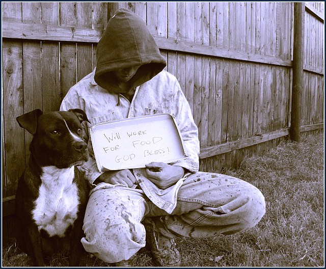
I really like how you hid most of the face of the man so he is much more anonymous. I think that lets the subject of "dog and man" ("man" in a broad sense) shine through. The postures of both subjects are good. I see the dog as looking very strong, and standing by his weary friend, the man. The eye-spots on the dog really help give it life and character. Good strong message in title and photo. My following comments presume this is a setup shot.
-Lighting
I think the lighting is pretty good, though the sign might be a little too white, so it appears relatively clean. Maybe a darker piece of cardboard would leave a tiny bit more focus on the dog and man.
-Focus/DOF
This comment sounds a little strange to me, but I think that a little more grungy looking photo could help the mood and message. The very deep DOF keeps everything quite sharp, though maybe a medium sharpness and some grain/noise could contribute.
(yeah, i know.. "your shot is too well focused" is pretty weird)
-Composition
I think the clothes are fairly convincing (based on some road-side sign holders in Denver CO) though the fence looks pristine. If I could create any background for this shot, I picture him leaning back on a cement wall that might have a splash of grifiti on it. A "weary" looking building might enhance the "weary" man.
One thing I notice is his position looks uncomfortable to hold for very long periods of time (unless he is sitting on something I can't see). Maybe if he was in a position that could be easily held all day he would look more accustomed to being homeless.
-Color
I think the slight blue tint is interesting, and I also think that plain black and white would be good too. The general desaturation of color is what seems to help the dreary feel of the shot.
Very solid entry and great message with relation to the challenge. Good work :)
I thought this one would do better, was one of my favorites.
I love how you convey strong messages through your images.
By the way, great to have you back!!
You might enjoy reading Jack London's short-story 'To build a Fire'. You can find it here: //www.shortstories.computed.net/londonfire.html
I think London's story reflects what you were trying to suggest.
I like the duotone, it works well with the dirt on the clothes and the texture of the fence and grass. The crop is fine, too. I presume this is staged, so you might have written something else on that sign, referring to the relationship dog-man. 'If you don't give me food, I have to eat my dog' ;) Just kidding. Great picture. 8.
Although this appears to be staged, it is a powerful image nonetheless. The dog is stoically by her master's side, for better or for worse. Excellently composed.
One suggestion for improvement. Care should be taken not to over sharpen as there are significant artifacts in the blades of the grass as well as the sign as a result of extreme edge sharpening.
This is a great photo, composiotion and light is perfect. The sepia mode goes really well with the mood. If there is anything I would change, it is the background. It looks like really nice fence, which doesn't go as well with the rest, it makes it look staged. If you could find a place that looks more torn down, maybe some grafitti, it would really add to the composition. GJ!
Brilliant idea, and well set up. Clothes aren't great though, I know this is about photography but homeless people don't roll around in mud :p However, great idea, great shot. Bumping up.







 Add photograph to your favorites
 Add photographer to your favorites


 Photographer found comment helpful.


