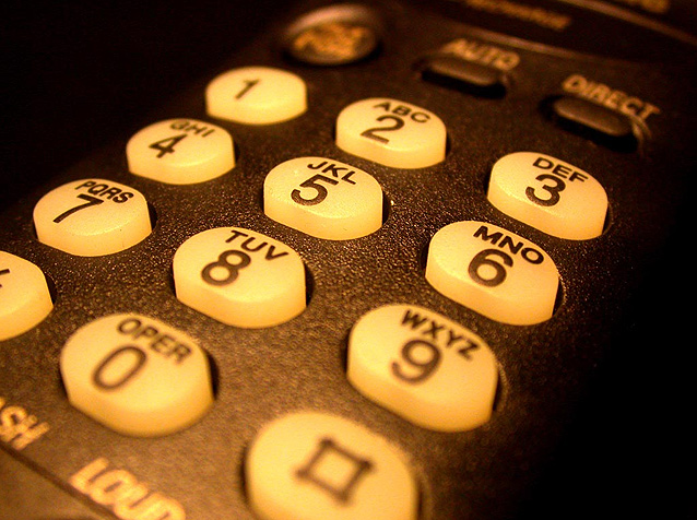
having just the bottom row of buttons out of focus seems distracting to me. My eyes are drawn to the # key and the 0 just because they don't flow with the rest of the shot. Otherwise I like the shot. I even like that the non-digits buttons are blurred.. just a little more depth of field would help though.
Bland but with strong technique. It would work for stock photography I think. However, there seems to be an icky yellow colour cast that doesn't appeal to me.
This is a great macro of the 5,3 and 7 buttons. I guess you already knew that. I don't know the significance of the number, but to those that do I hope you sell a million or so prints. 5
Good stock photo with a nice shallow DOF, which is common in such photos. I myself wouldn't have cropped it so tightly, although that doesn't lower the quality of the image at all.
I believe that the yellow tint on the phone keys may hurt the overall impact of this image... maybe a little white balance adjustment in the camera would make this shot much stronger :) - setzler






 Add photograph to your favorites
 Add photographer to your favorites


