When I saw the challenge I wasn?t very enthused. As I thought about it I became more interested in an idea I had and as I got into it I became more and more involved. First setting up in the basement looked dull with an artificial backround. Ultimately I ended up in the kitchen using a combination of flash and natural light. In spite of a few changes I would have made in the composition I am happy with the result and it turned out to be a lot of fun. What a mess I made!
Statistics
Place: 3 out of 17 Avg (all users): 6.5185 Avg (participants): 6.0000 Avg (non-participants): 6.9333 Views since voting: 518 Views during voting: 100 Votes: 27 Comments: 17 Favorites: 0
I also looked at the comments on your picture. It's a nice picture - but not an outstanding one. Willem is right to mention the flat lighting, the missind shadows and the cluttered background.
I myself was enthusiastic about the idea, but there would have been room for improvement in the realization. My vote was still a benevolent 8
Originally posted by GolferDDS said on 2025-01-06::
Originally posted by roz:
this is amazing ..
I hadn’t seen this challenge until Anita told me how yours should have got the blue ..
so of course I came to check it out ..
WOW .. brilliant result .. and I loved reading your backstory .. :)
feel sad about those low votes .. would love to know why .. :(
Thanks Roz And Anita,
Yes, I would love to hear from the low voters so I can learn how to improve my results in the future.
I gave it a 4 for reasons already explained during the challenge. The flat light seems to be a trademark/style (on camera flash?). I noticed I often make that remark on your images. The images often lack shadow contrast in my view. If I look at the histogram it is often quite narrow. On my phone it looks better but on my calibrated screen the images look often really flat. This aspect often takes 1 or 2 points of my rating.
Hi Willem,
I thought this would be an interesting discussion so I created a forum to continue.
Thanks,
Larry
Originally posted by GolferDDS said on 2025-01-06::
Originally posted by roz:
this is amazing ..
I hadn’t seen this challenge until Anita told me how yours should have got the blue ..
so of course I came to check it out ..
WOW .. brilliant result .. and I loved reading your backstory .. :)
feel sad about those low votes .. would love to know why .. :(
Thanks Roz And Anita,
Yes, I would love to hear from the low voters so I can learn how to improve my results in the future.
I gave it a 4 for reasons already explained during the challenge. The flat light seems to be a trademark/style (on camera flash?). I noticed I often make that remark on your images. The images often lack shadow contrast in my view. If I look at the histogram it is often quite narrow. On my phone it looks better but on my calibrated screen the images look often really flat. This aspect often takes 1 or 2 points of my rating.
this is amazing ..
I hadn’t seen this challenge until Anita told me how yours should have got the blue ..
so of course I came to check it out ..
WOW .. brilliant result .. and I loved reading your backstory .. :)
feel sad about those low votes .. would love to know why .. :(
Thanks Roz And Anita,
Yes, I would love to hear from the low voters so I can learn how to improve my results in the future.
this is amazing ..
I hadn’t seen this challenge until Anita told me how yours should have got the blue ..
so of course I came to check it out ..
WOW .. brilliant result .. and I loved reading your backstory .. :)
feel sad about those low votes .. would love to know why .. :(
Nice take on the challenge. The hanging fruit looks a touch unnatural - like you cloned out some threads that it was hanging on, but I still like the concept and overall execution. 7.
There is so much going on that I hardly noticed the tarts. Overall very flat light, no shadows, and the falling fruit also feels edited in, as result of the sharpness versus the background and as result of total lack of shadows. It does not appeal to me.




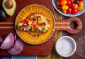

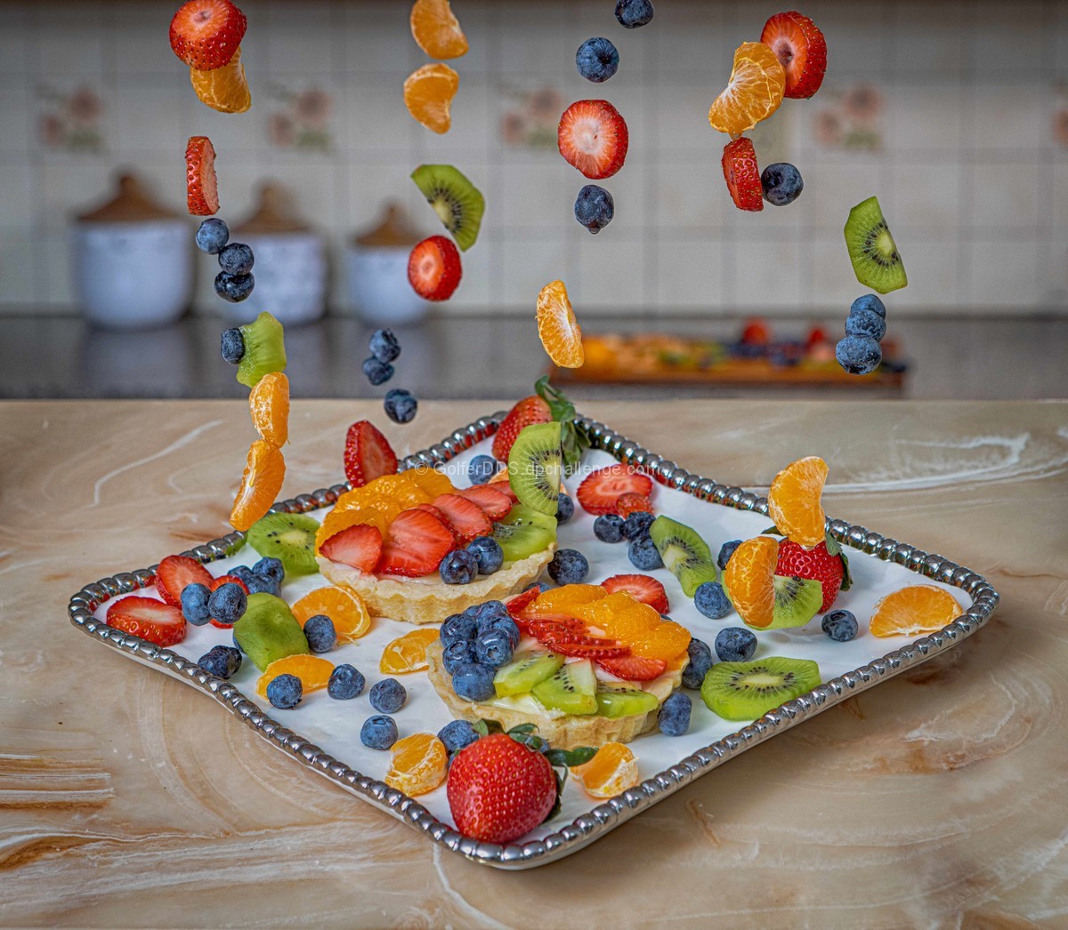
 Fruit Tarts
 Add photograph to your favorites
 Add photographer to your favorites


 Photographer found comment helpful.


