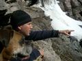
This is so cute! I love the expression on the dog's face -- and I hope you shared at least a bite of your hotdog with him :) Knowing the dpChallenge crowd, I'm guessing you are hearing about the frame being too big. Maybe just a little too big, but the thin blue border around it really brings out the colors. And the composition is great too. I absolutely love this picture! I hope it does really well.
Likes: the composition, the white border, the expression on the dog's face.
Dislikes: the blue frame (maybe black?), the title (a bit confused by the pronouns).
Think the image could have been larger, but it's a good capture regardless!
Your photograph had potential but its to small. Your focus is good and so is the lighting. I like the sharpness and color. Border is very distracting since the photograph is so small. I wish you could of posted a larger version. Good luck in the challenge.
Excellent photo. Very sharp, colors well balanced. I don't mind this type of border, but you should have created an equal width, uniform border. The inner blue border is not of uniform width...the top side is one pixel thinner than the sides and bottom. A photoshop trick that many people use is to select the appropriate background color and increase the canvas size by the width you want the border to be. In this case, you could have first selected blue, then increased the canvas size by 3 pixels all around. Then select white, and again increase border by increasing the canvas size.
That's a great photo but unfortunately it loses it's impact by being so small! You are allowed a maximum length of 640 pixels on either dimensions, use it to give more impact. This is one of the best photos of this challenge.
I hate the frame, and the small size of the picture whcih is gonna cripple you in the voting. However the composition is great and so is the bakground. Well done, but don't use frames and maximies your picture.
If only it was bigger -teh pic, not the border. The border is too big already. Please ask or read the tutuorial on this site on how to size an image for entry into a challenge. This one is too small.
I'm one of the people who actually like borders, but I don't think this one helps the shot. It's such a nice picture that making it just that much smaller with a frame is a detraction. Still, the photo itself is excellent - one of the best in this challenge.
The border is distracting and the image too small. Getting rid of the border would have allowed you to submit a larger version of the image, with more detail.






![[ she, its hot dog, and its friend ]](https://images.dpchallenge.com/images_challenge/0-999/289/1200/Copyrighted_Image_Reuse_Prohibited_129164.jpg)
 Add photograph to your favorites
 Add photographer to your favorites


