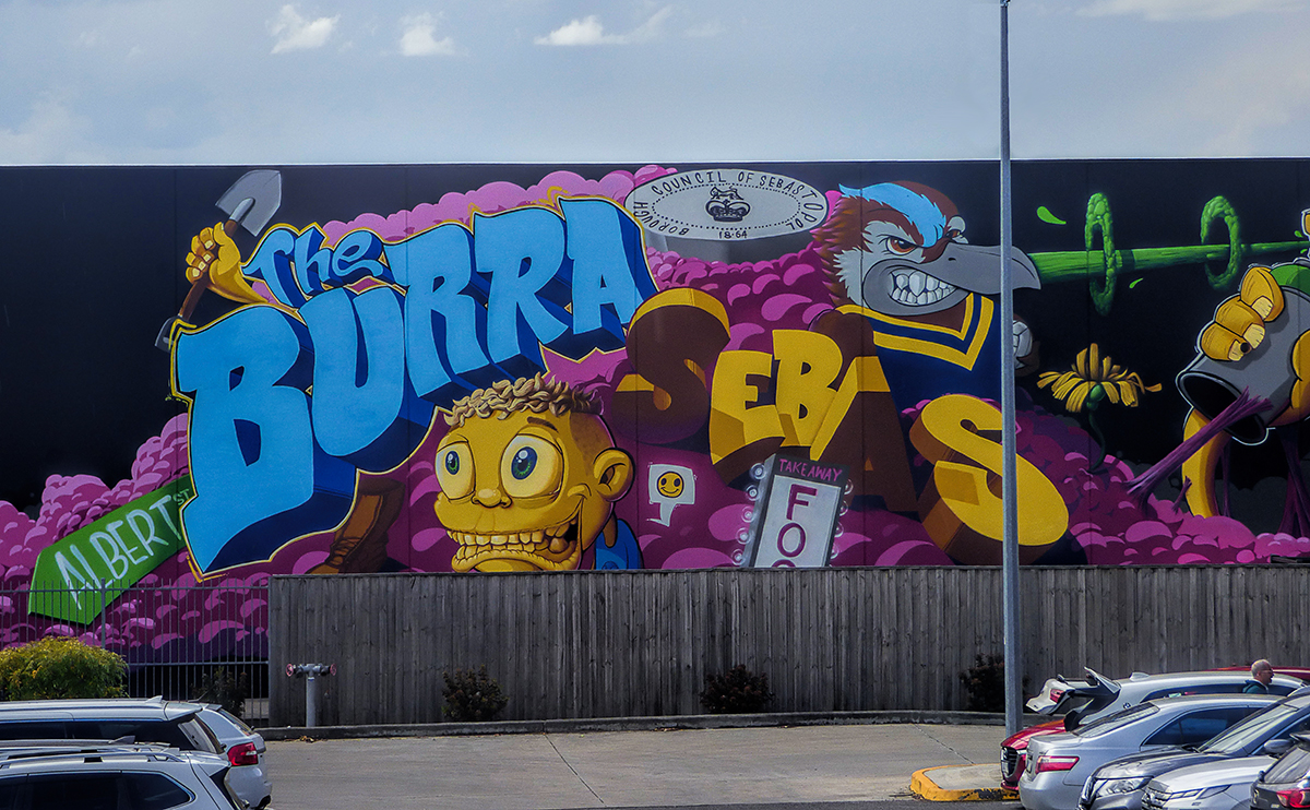
I want to like this more than I do, as a photograph, but the singular element engaging me is the artwork, not the photographic intentions of the maker. The composition seems entirely accidental, in that it's apparently informed by where the maker *had* to stand to get the squared-up elevation. The cars distract, mostly because it seems like truncating them this way was an attempt to minimize the distraction. I suspect if the foreground were expanded to include more of the cars, the effect would be better. The sky tone is spot on.
But what do I know? I like it, but I'm not entirely satisfied, if you catch my drift? |






 Add photograph to your favorites
 Add photographer to your favorites


 Photographer found comment helpful.