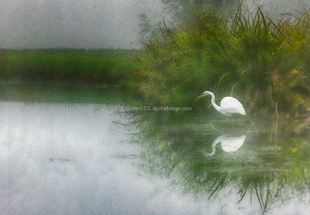
I get what you were going for. I think, outside of the PP, a tighter presentation would have been more pleasing. The left area of the image, while serving as effective negative space, could have been trimmed. Take a bit off the left and the bottom; bringing the bird tighter on the lower ROT grid, but still have enough breathing room to not feel cramped.
Just some random thoughts. :-) |





 Add photograph to your favorites
 Add photographer to your favorites

 Photographer found comment helpful.