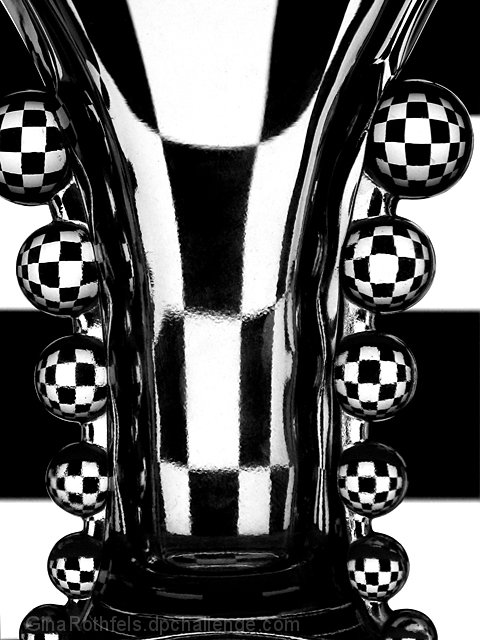
This was based ont he orange/blue, mirrored vases in "opposites", and it's about as creative an interpretation of that image as I can imagine. For one thing, no color. For another, no vertical mirroring. Thirdly, no left/right "swapping" of colors (or anything else).
Now I quite like this image, and I ranked it high in the challenge. I'm surprised it didn't pull a 6+. What was working against it?
As mentioned by me (and several other commenters during the challenge voting), The assymetrical framing of this is really hurting it. Granted, the original was an asymmetrical image in toto, with the subjects pushed to the right, but we could see all of those vases, it's just their location within the frame that was off-center.
I believe if this image had been perfectly symmetrical it would have picked up at LEAST another half point in the voting, maybe more. That's really the only comment I can make about it, beyond that it's a stunning almost-abstract image in its own right.
Myy first thought is 'which shot is this based on?' There have been so many shots of refractions through glass that it's difficult to retain them all in mind, I find. The bobbly bits down the edge ring a bell, vaguely, I think. Anyhow, good shooting - control of sharpness is i think the key to such a very graphic image, especially with such hard edges between black and white.





 Add photograph to your favorites
 Add photographer to your favorites

 Photographer found comment helpful.


