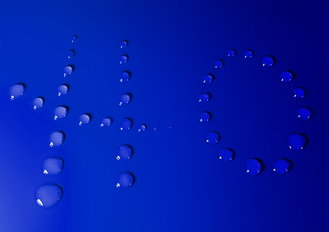
Based on kiwiness' great H2O photo in the Science challenge.
I was originally going to have it saying HO3, as in 3 Ho's, Ho Ho Ho, but that didnt look right so I just stuck with one Ho. I think Jacko will vote this 10 cos he likes the word Ho. I think everyone else will just vote it average cos compared to kiwi's original this is pants.
Statistics
Place: 16 out of 106 Avg (all users): 6.6699 Avg (commenters): 7.2941 Avg (participants): 6.3889 Avg (non-participants): 6.8209 Views since voting: 2125 Views during voting: 443 Votes: 206 Comments: 22 Favorites: 1 (view)
Very well thought out. The smaller drops of water toward the top give the image a nice overall perspective. The way the light fades away toward the top right corner makes the plain background rather interesting -- especially because the water droplets maintain their sharp color throughout the image which adds a nice depth.
Your composition is great -- there's just enough subject there for my taste, and there's also the right amount of space left to 'surround' the subject to give the photo its interest.
i like the creative twist very much. i kind of wonder what the white specks are in the H's drops, though.. unfortunately, that might hurt you (unless i'm the only one).
Cleaner and neater than the original, I would say. Unfortunately, I don't see that you've moved things on much from what was never a particular favourite of mine anyhow. Technically, it's beautifully done, absolutely flawless I would say. It still elicits a big 'so what?' from me though.
Now if you had put a 3 to the right and made it Ho to the 3rd power............... LOL! I love this, the lighting seems a bit dark on the right but otherwise very well done! A 9






 Add photograph to your favorites
 Add photographer to your favorites

 Photographer found comment helpful.


