I do appreciate that Moondoggie-- and for everyone else, I'm going to take a minute to explain.
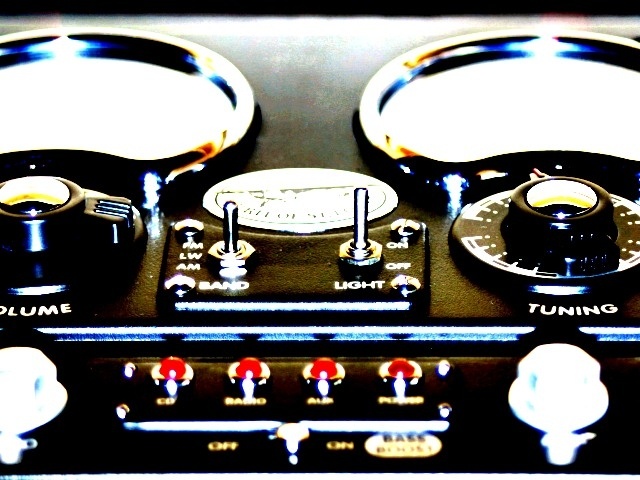
1. The spirit of st.louis probably didn't have a radio in it.. don't pay so much attention to the title.. it's simply a radio, and it is the Name of the radio. It's embossed on it.. thats what the design was based on.
2. No, I wasn't in the cockpit of the airplane.
3. This shot DID meet the criteria of the "ground up" challenge.. This radio was on a shelf, above my head, I layed on the floor below it (the ground), and took the picture from under the radio, hence the dramatic upwards angle. It honestly seemed to me like if it wasn't a picture with some sky in it, people didn't think it was "from the ground up."
4. I know it was over exposed and over sharpened with a really high contrast. I personally liked that.. the origional image was rather dull, and it added some interest into it.
Initially, I wasn't certain I liked the way this was so over adjusted (whether in camera or in computer doesn't matter) but the lok grew on me. I think I'd like it better if it were either more centered on the two middle switches or more off center.
The overexposure almost works here, but not (IMO) in combination with the oversharpening (looks pretty jaggy). Symmetrical subjects like this usually look better centered, as well.
nice overexposure, you are probably getting a lot of comments about what you should have done to prevent it, like you are some sort of moron for not knowing what you have done. people here only vote on what makes them feel good and warm inside, and not on originality or substance. ignore the masses and do what you want.
there are a few problems here...1)picture is offcenter...2)picture is washed out...3)picture isn't really from the ground up...4)some of the dials aren't even in focus
Interesting exposure. Not sure how the title relates, the guages seem a little advanced to have come from the actual plane.....plus I don't think they let people in the cockpit. Doesn't really fit my definition of the challenge
This is a neat photo but I am having trouble relating it to the challenge. The foreground is out of focus. It looks like your editing software got a little out of control with you as well. The contrast here is very harsh. I know that the Spirit of St Louis was an airplane but I don't see an airplane in this photo. Centering up those knobs at the bottom would have been helpful as well.
The burned out dials really work, as well as the high contrast and sparse but bright colors. It's just to ever-so-slightly off-center as to seem like a mistake though - I might have liked it better had it been exactly symmetrical or more off-center.
amazing effects achieved in this photo The impression of aeronautical really adds to the shot I like it when the photograoher has put that little bit extra thought into their image to add an extrea dimention to the challange... well done... top marks





 Add photograph to your favorites
 Add photographer to your favorites


