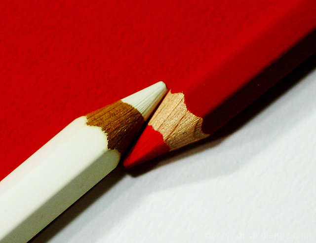
I changed the angles and positions for impact.
Cropped, resized, Adjusted brightness and contrast to -13/+26, adjusted curves to input 98 and output 132, sharpened USM, saved for web.
Sorry Remie, you are the master but at least I tried.
Statistics
Place: 55 out of 106 Avg (all users): 5.9849 Avg (commenters): 6.0000 Avg (participants): 5.6806 Avg (non-participants): 6.1575 Views since voting: 1397 Views during voting: 332 Votes: 199 Comments: 13 Favorites: 1 (view)
Well, no one can compete the original work and Remie is a wonderful artist, but yours is great just as well, and I am more then proud to share the same thought with you on this pic.
Another excellent chance for a side-by-side comparison. This is an excellent tribute to Remie's original. I get the sense that your lights were not quite as powerful as his (maybe trying to avoid blowing out the whites?). The result is that your reds are not quite as vibrant either, but it's still an excellent photo, and one you should be proud of. 7.
In amny senses this is a wild improvement on the original, which actually suffers from big technical problems. What you don't have, for me, is the big bright punchy over-exposed feeling (good thing? bad thing? don't know), and this to my eye suffers a bit for that - in a way it's too realistic this, rather than having the disgned edge of the original. As a variation - well, the set-up itself is so very designed, that I'm not certain of the benefits of this approach.






 Add photograph to your favorites
 Add photographer to your favorites

 Photographer found comment helpful.


