Thanks to all for your votes and, specially, who made comments.
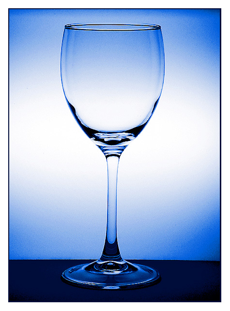
This shot initially was a glass with red wine, but first I took some shots with the empty one and the results were nicer to me. The glass was set up in front of a light box. The camera white balance was set at fluorescent light. Then some adjustments in PS (levels, contrast and a little sharp).There´s no more lighting and, of course, I used a tripod.
Thanks again!
That title is extreme! But the photo is very beautiful. It would definitely work as a stock photo. The colours are just gorgeous. Seems a little bit jaggy along some edges though. I'm giving it 10 nonetheless.
Good job, like the lighting. The jagged compression lines are distracting, also the stem of the glass is not quite straight. Still could surely see this as a stock shot. Great title too!
Are you trying to say it is just another Blankety-Blank glass? It looks a little over processed and kind of grainy to me. If it had been very sharp I could go higher but now only a 4. In a situation like this one you have complete control of the outcome, so it should be much better.
You got one item for 11 different uses here, but I can't give you 11 points for it for some reason :-). I think you did well with this shot, it is nice and sharp and in focus and I could think of many ways to use it in campaigns or presentations. The colour is bang on too. Good one!
Great job lighting this! I know how hard it can be. I think the photo however suffers slightly from over-sharpening. I can see jaggies on the edge of the glass. This can also be helped by using Bicubic resampling instead of Bilinnear. Great blue tones too.
A very nice simple and clean image, I like that a lot. You've done an incredible job on the glass, no reflections or blown-out highlights, wonderful. The background behind the glass is very nice also, the surface the glass is standing on is very distracting in my opinion, it introduces a much darker color and a clear straight separation of background vs. surface in an otherwise curvy photo. To my eye, it also looks just a tad rotated, but that may be me not holding my head straight today. :) I would suggest redoing this with a different surface (put the glass on a curved piece of cardboard that serves as background and surface?) and you have a winner in my mind.
This is a very strong image. I love the blue toning and the centered composition. The background color gradients also work nicely... great shot :) - setzler
I like the blue color and your overall lighting. You've not only captured the challenge in your photo, you've even followed through with the title! Beautiful job.
LOL. I'm voting on this one first because your title indicates that you're someone who spends a LOT of time on corbis (like me). It really did make me laugh outloud!
Oh, yeah...and good shot too. Very simple and I like the blue tint.
Great subject and composition. The tight center crop works very well. The pic IMO looks like its been oversharpened or taken with a high ISO. It also is a little overexposed for my tastes. The blue is a nice color for the background.


 one item, wine, glass, drink, vertical, nobody, close-up, empty, curve, blue, fragile, transparent



 Add photograph to your favorites
 Add photographer to your favorites

 Photographer found comment helpful.


