Originally posted by Neat:
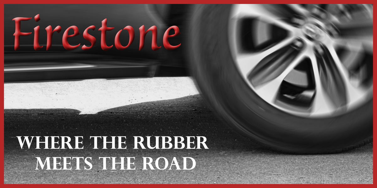
Not sure why the whole photo is not in colour, not a big fan of select desaturation. The blown out part underneath the car is distracting also. My eyes keep veering there. I do like the motion on the wheel however. |
The photo isn't in color because I converted it to black and white; it was a black car and the road was basically black - the only hint of color was a bit of gold on the wheel rim - not sure what you mean by selective desaturation here. 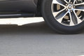 Unless you thought the "Firestone" lettering was on the car in the first place? I worked hard to find a font that I thought came as close as possible to that of the company's logo - I'd be pleased to think I was successful at that :) Unless you thought the "Firestone" lettering was on the car in the first place? I worked hard to find a font that I thought came as close as possible to that of the company's logo - I'd be pleased to think I was successful at that :)
I added the red Firestone to identify the product I was "advertising" and and the red border because I thought it gave the photo a more finished look for a billboard. I agree that the bright area under the car is distracting - the light was not good and this certainly isn't a great photo, but I wanted to play so I put it in :)
ETA: And now I see that the best place for the red FIRESTONE lettering would, in fact, have been right under the car - on the bright area that draws the eye!
Message edited by author 2024-03-04 10:06:00. |






 Add photograph to your favorites
 Add photographer to your favorites


 Photographer found comment helpful.