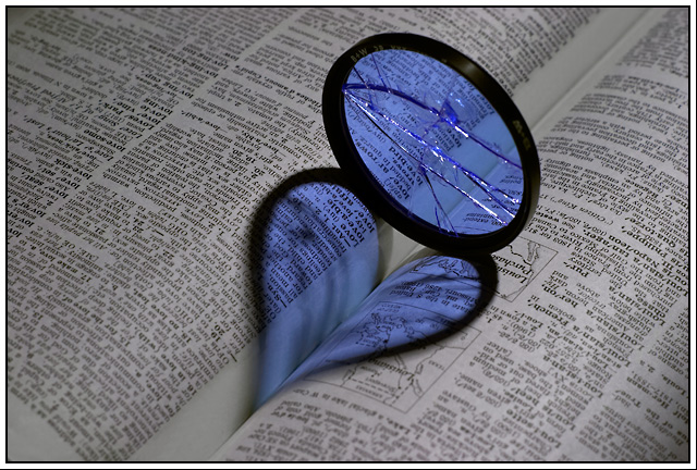
Obviously a "tribute" to Love by Konador (Shadows II challenge) except I used a filter that I dropped yesterday and broke. The filter was brand new, I wanted to use it as a prop to collect snow do redo EddyG's Snowflakes, but strong wind blew it from my balcony and slammed it into a wall and broke it, then it fell 3 stories without further damage. And since Konador got a red ribbon with a red heart I, of course, fully expect a blue for a blue heart :)
This is my most Photoshopped photo to date, first I had to remove a line (clone tool) caused by transparent tape I used to fix the page in it's spot (so that the word love would be in the shadow). Then I desaturated yellows, reds, magentas and greens, and fiddled with blues and cyans and master till I got the right result. Then lelels, flatten, 16->8 bit->sRGB, rezise, USM.
The filter is B+W Med blue 80/1.5x
This is shot with 50mm 1.4 with two ND filter 2x+4x for more time (I didn't want stop lower than f/8) and a CPL to get rid of reflection on top of filter and on the page itself (and more time).
I also used a mirror to reflect light back to the filter and illuminate the cracks.
Statistics
Place: 11 out of 106 Avg (all users): 6.7610 Avg (commenters): 7.2941 Avg (participants): 6.4412 Avg (non-participants): 6.9197 Views since voting: 14327 Views during voting: 418 Votes: 205 Comments: 25 Favorites: 8 (view)
This is a great contrasting version on Konador's image. I studied the image quite a bit prior to reading the comments and your explaination and agree with your execution.
The composition truly represents the heartache of love...Red drives love and the heat of passion, while blue creates a distance, less romantic (cold) feel...and the convenience of the filter being broken just adds strength to this image. The fact that the book was upside down made sense to me prior to reading your reasoning...Love is definately in turmoil here.
Technically, I would have liked it to be a little sharper. I would have liked to see more lighting or more of a spotlight effect as in the original image, however I do like the gleam of the light off the cracks in the filter.
Another option that may have enhanced the contrast would be to have the light shine on the filter from a higher position to minimize the size of the reflecting heart, but of course it may not have appealed to some.
A great entry to this challange and deserving of your 11th place result.
2nd try
First of all: thank you all for your comments and votes. Getting a pat on the back from Dan for creativity/originality means alot to me. Thanks Dan
This is (obviously) a spoof on Konador's red ribbon in the Shadows II challenge.
Here is his original version, called (fittingly enouch) Love:
As I said in the Photographers comments I did not break the filter for this. I actually think filters are probably quite hard to break, esp better ones like B+W, but I'm not gonna experiment to find out, thank you very much :) The filter broke by accident and I almost posted a picture of it in the Broken Challenge outtakes thread, as this happend just a day to late for entering the challenge itself. Then I got the idea that let to this image.
The filter was, and still is, light blue (B+W 080 1.5x). And since it's broken, the love must also be broken, right? So it's got 'em blues. That was also one of the reasons why I placed the dictionary upside down, the love has gone wrong.
The book is the horribly big Websters Unabrigded Dictionary of the English Language. Fortunately L is close to the center of the book so the fold was deep enough for a nice shadow. Only problem was that most of the defintions of Love were in middle column (of 3) and therefor far from the crucial fold. So I just folded the page so first column disappeard and the 2nd column was by the centre. But then there was a nasty line which caused even nastier shadows. So I taped the sucker down :) I actually also taped the edges of page so it would be nice and taut. By balancing the book I could make the filter stand up on it own (without the use of glue or Blu-Tack or anything).
To make the page look better I first shot it without filter and used that as Custum WB. Quite a neat trick. Just remember to reset your camera when you're done :)
Here is the original, unedited photo:
Most of the editing work involved blurring the line of the clear tape I used to hold the page in the right position.
I've had a couple of PM's about why I used ND filters. There are several reasons, none of them very good:
#1. I had 'em. I had just recieved an order from B&H photo including 2 ND filters (and a extension tupe set, haven't had chance to use that much yet), and I was just dying to use these ND filters.
#2. For some strange reason I had this idea that DOF was in someway related to the length of the exposure. Now I know better. See also this tread about Aperture vs shutter speed and DOF
#3. Since I had a bit more time to play around in I held a small mirror in front of the filter and reflected some of the light back. By moving the mirror I could highlight some of the cracks in the filter without any noticable shadows on the other side.
#4. Just for the hell of it.
This photo was a lot of fun to take and to have it score well in a difficult challenge (score-wise) was even better.
Feeling blue? This is sharp as a tack, I liek that. I kind of wish the dictionary were inverted and the (readable) text somehow relevant to the image title...
Sorry to see you sacrifice a filter for this but this photo works. However, the original is better composed and in my personal opinion a red colour of the filter would have worked better since most people (myself included) associate love with red. I gave it a 7.
Nicely executed, though I'm surprised by your decision to shoot the book upside down - it's good work, obviously, but just doesn't quite do that extra thing for me, even with the broken thing.
Get's the thumbs up from me, nice job :) If anything I would say the lighting was a little bit flat, resulting in not very much variation of shade on the pages, but that doesn't matter too much :)






 Add photograph to your favorites
 Add photographer to your favorites

 Photographer found comment helpful.


