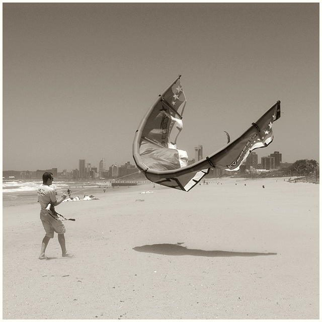
Challenge:Wind (Basic Editing II) Camera:Sony DSC-F828 Location: durban beach front Date: Dec 12, 2004 Aperture: auto ISO: auto Shutter: auto Date Uploaded: Dec 14, 2004
This is an exceptionally nice image, perfect for the challenge. I didn't view or rate all the images in "wind" or I'd surely have ranked this right near the top.
I'm going to come right out and disagree witht hose who advocate cropping top and bottom. IMO this would be a serious mistake; the square framing is optimal for this image. It's all about this absolutely palpable tension between man and kite/wind, and this is taking place on an almost pure diagonal that could only be weakened by the cropping. A square format is very good at highlighting such internal, push me-pull you tension.
Likewise, is trongly believe the monochrome is right for this image. I'd have to see the original to be sure, but as I visualize it in the original you have two large gields of color top and bottom competing with each other and the kite popping out and up from that conflict. I see the color fields introducing an unnecessary element to the competition between man and wind. In this monochrome version, the values of sky and sand are so similar, so down-key, that they provide a more neutral field on which the conflict may evolve. Your choice of sepia-like tonality is optimal to my eye, as it introduces a vaguely "dated" look to the image, making it somehow emblematic of an eternal battle man has always fought.
So this is all good.
What's not so good? For one thing, the collapsed kites on the beach under the figure's feet are distracting. Absent the basic editing rules, I'd brush them out or at least burn them down (how we would have done it in film days) so they are less distracting. Almost as problematical is the scimitar-like edge of the seconf kite rising from behind the subject kite. I'd also brush that out, absent the rules.
Finally, in an ideal world this kite might be a tad more airborne, so the bottom curve was actually clearing the skyline behind. That's about it for nits. This is an exceptionally fine entry and I'm a little surprised it didn't place higher.
Nevertheless, a very good showing for a terrific challenge solution.
Great compostion and entry. This captures the power of wind with conviction from the kite, the dusting of sand around his feet and the surf in the back. converting to a B&W (or via desaturation) helps strengthen this image...8
A perfect capture for the challenge. Good composition, love the tones. It's a shame about the buildings in the background but something that obviously can't be helped too much. My fave for this challenge.
great pic, is and was one of my favorites. i like the focus and composition. True, some people just have this talent to see a great pic and capture it.
My only complaint about this shot is the choice of BW verses color. I, of course, don't know what the color shot looked like, but this subject just seems more appropriate for color. Judging from the direct shadow, I am guessing the sky might have been too blown out at this time of day. The composition and choice of subject are great. 8.
Great image, well matching the challenge. I am not sure what the original colors were, but given that the kites are usually colorful and most likely contrast both the sky and the sand well, I wonder if the color image would have been better here. 8.
I really like this shot and it's an excellent subject for this challenge. I think you would draw more attention to your subjects if you cropped off the top and bottom 10-15%, but regardless, the shot came out very nice like this. Good job!
Now THAT'S wind. :) Nice capture. Not sure about the b&w treatment. The background and sky look a bit flat and washed out. The kite does stand out well though.





 Add photograph to your favorites
 Add photographer to your favorites

 Photographer found comment helpful.


