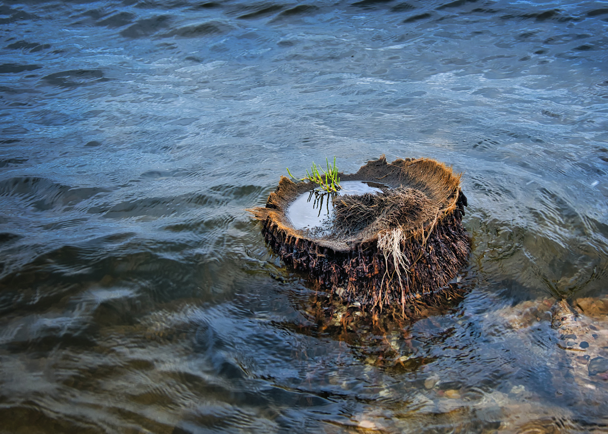
When you don't have stupendous wide landscape to fit the topic, then go in close.
I liked the idea of this in B/W to focus on the textures, but the tonal variance wasn't enough for the stump to stand out from the background the way I wanted.
I really like the textures of the palm stump, the reflection of the puddle in it, and the swirling of the water around it. Not sure how it will come off with the collective though. High 5 to low 6 perhaps. But I've been wrong before.
Statistics
Place: 28 out of 29 Avg (all users): 4.7667 Avg (participants): 4.6364 Avg (non-participants): 4.8421 Views since voting: 306 Views during voting: 54 Votes: 30 Comments: 2 Favorites: 0





 Add photograph to your favorites
 Add photographer to your favorites


 Photographer found comment helpful.