This comment comes courtesy of the Critique Club :)
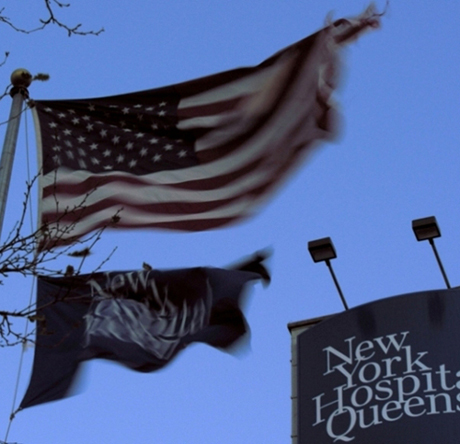
The first thing that strikes me here about this image is that it is full of motion. It definitely depicts 'Wind' well. Where it falls short, however, is some of its technical aspects. Color rendition could have been a little better - possibly editing this in some kind of graphics program, or exposing a little differently at the time of the shot (the main thing is that it seems a little dark - the whites on the US flag aren't quite as white as they could be in this image).
Other small things - the branches in the foreground are slightly distracting (and the sign in the background) - especially due to their static nature. This could be a great shot if you eliminated some of the distracting elements and possibly brought the exposure level up a notch or two.







 Add photograph to your favorites
 Add photographer to your favorites

 Photographer found comment helpful.


