Var búinn að steingleyma að athuga í hvaða sæti myndin þín endaði. Algjör klassi, hefði að sjálfsögðu viljað sjá hana í einu af þremur efstu en gott engu að síður :-)
Ps. Ég er engan veginn sammála liðinu hérna að ramminn sé ekki að gera sig. Mér finnst hann látlaus og góður.
Wonderful shot and great finish. I just looked through your portfolio and was very impressed by your work but even more so when I saw your age. You have a great eye for photography.
This is definitely a winner. Congratulations on your 4th finish. You have all reasons to be proud of this image. Yes, I agree, it should have ribboned. Keep sending them in.
Definately the smartest composition of the conest (wink)...I much prefer your lighting and shadows to my version, however I think my model is way cuter. If I could have set up my lighting to cast the shadow, our images would have been identical, however a decided to crop it. Nicely done...7
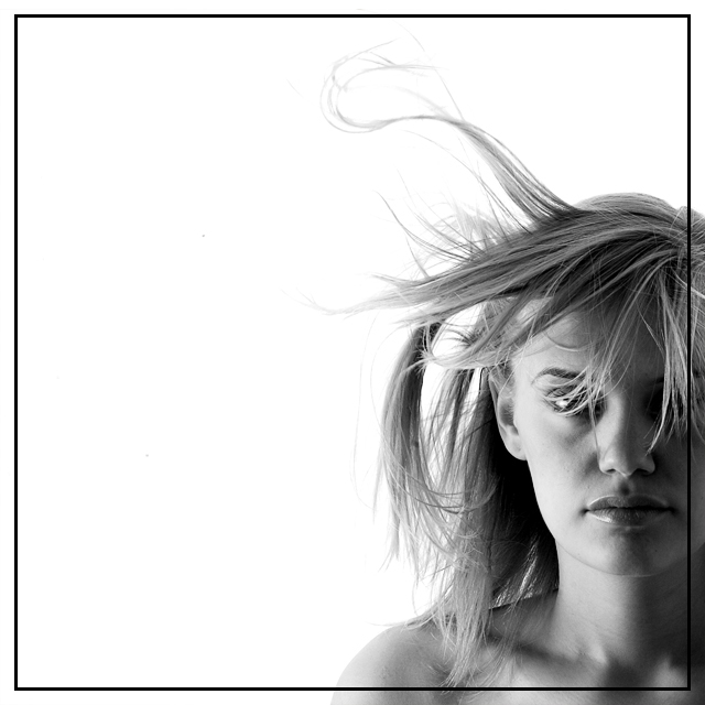
Well done - gray tones...I like the way you've chosen to position the model in the lower right-hand side of the photo, instead of dead center. Very effective. Good motion of the hair. Excellent shot!
Beautiful. Masterful use of light. The composition is dramatic and powerful. The two black dots in the white space are unfortunate. Really they just highlight how dramatic the image is.
Wonderful sense of contained energy - the stillness of the model and the wildness of her hair - very exciting. Great use of negative space - it really adds something to the composition.
there are one or two similar set-ups as you have created in this challenge. well executed, but I wish I could see a little more of the models eyes to hold my attention - well done
Great. You made a very effective use of negative space. I usually don't like semi-transparent borders but this one great. The nice soft lighting from the left emphasizes the half of the face which is oriented to the center of the picture. The title is a perfect match, too. Nothing annoying here. 10. Good job.
Edit: Now that I've seen the other pics, I can say that I will eat a broomstick if you don't get the blue ribbon. Good luck.
excellent image but I don't like the border too much, seems just a bit too heavy - that said it's not a big enough reason to mark it down - well done (10)
I give this one a 10. I can almost "see" the wind in the empty space to the left. The lighting from the left works well as does the cropping to the right. This is the first time a DPC photographer has used a border that I felt enhanced the photo rather than distracting ifrom t. The simple solid line is aesthetically pleasing. I just can't say enough about this photo. It shows real thinking outside the box and sets a new standard -- for this challenge and DPC in general. Thank you!
I don't really like the off-center (way too off-center) composition. and the black border thingy really adds nothing. still, nice lighting and I like the expression on the subjects face
interesting choice of crop - not sure if i like it or not yet. i do really like the picture though - especially the wayward bunch of hair that is flying way upwards.. without that, would be a point less than what i'm giving it.
Nice shot, I like the lighting a lot. It's always nice to see a brder that's not tacky and accually adds to the image. Well done. I think this should be a medal winner.






 Add photograph to your favorites
 Add photographer to your favorites


 Photographer found comment helpful.


