|
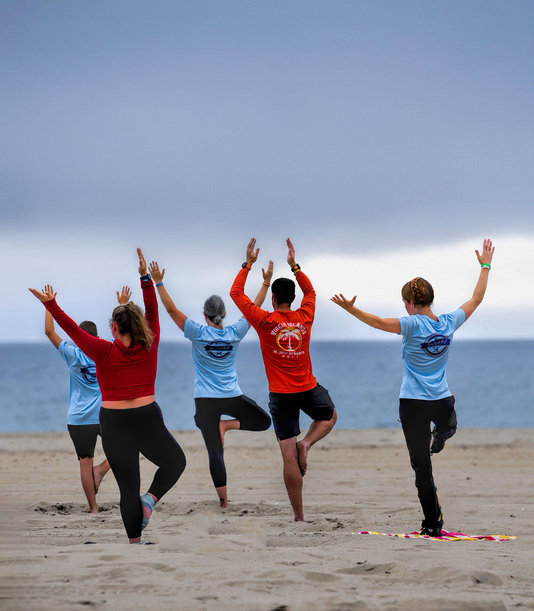
Fun place to see and capture this image. The color coordinated t's are fun. Couple of things otherwise ... seems like a lot of negative space up top that's not really contributing to the overall feel and composition. And - what's up with the non-title? |







 Add photograph to your favorites
 Add photographer to your favorites


 Photographer found comment helpful.