This comment comes courtesy of the Critique Club :)
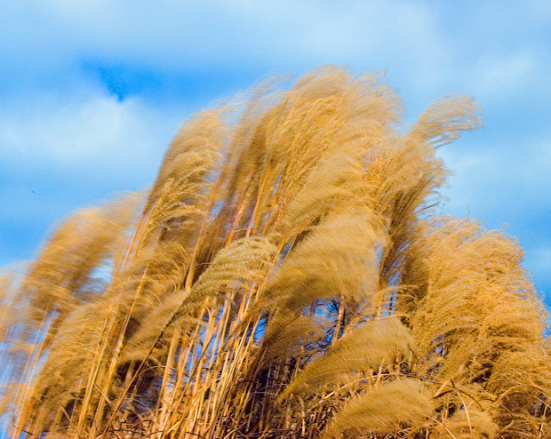
The first thing that catches my eye in this image is, of course, the motion blur. It works well here to depict "Wind". Obviously, an extended shutter speed is pretty much out of the question considering the time of day (and that you already went down to f/22 for this one). You definitely created a good sense of motion given the sunny conditions you had to work with (must have been a windy day?).
I also noticed that, to me, the image has a bit of a different feel. It took me a little while to realize (with the help of some comments) that this could in fact be what looks like a slightly unnatural color. If this came out of your camera, then it certainly produces its share of contrast and saturation. I think this is more evident in the blue skies than it is in the foreground colors. If it did come out of the camera this way, I would consider possibly removing some emphasis from the sky a bit (via Hue/Saturation adjustments, I would guess) in order to place slightly more emphasis on the foreground. I might even consider a small crop at the top.
Overall a good image and you should be happy with it. I think a few more adjustments could make it really 'pop', but that's ultimately a matter of personal taste.
I think you missed an important venue for expressing your perspective on this entry by leaving it untitled. The sky has an unnatural hue and saturation as a result of what I suspect to be an overindulgence of hue/saturation adjustment. If the sky was indeed this color, then I commend you for an excellent capture. The motion blur is excellent in reinforcing the message here and quite appropriate for the challenge theme. Don't be shy in giving your entries a creative title. Ultimately, you are hurting yourself.





 Add photograph to your favorites
 Add photographer to your favorites


 Photographer found comment helpful.


