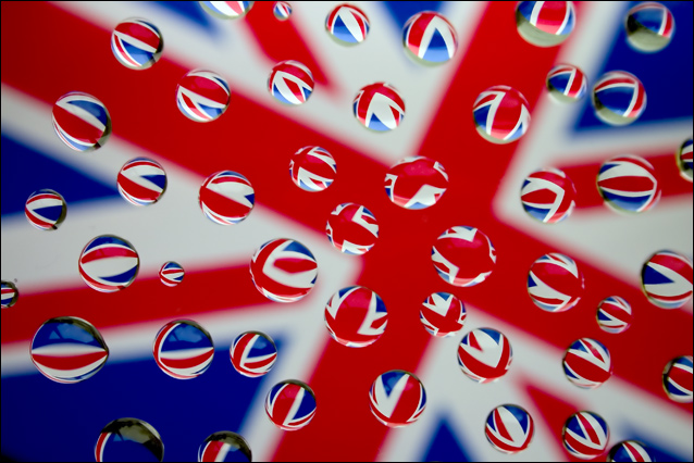
There's really not much I can say about this image except "well done!" The score says the rest, and I quite agree it's a top-10 image in the deja vu challenge. I went to the original, and I think this is a fabulous variation on it.
One thing I noticed is that the original is more "linear", where yours has a "zoom-out_ effect, with the zoom popping down to the crossed-bars center of your image. It may not be intentional, but it's a nice subtle metaphor; UK is an island, a focused place so to speak, where USA is a sprawling, linear kind of place. So that's good.
If I had any suggestion for improvement, it might be to try cleaning up the whites a little bit with curves. I'd like to see how this worked witha little more pop int he tonal range. But that's a nit. Good job!
It´s a bit to clean, to static for my taste or even to "perfect". No little droplets inbetween the bigger droplets and IMO that is what makes the original shot work so well. Not bad though, way better than what I came up with, gave it a 7.
definitely cleaner looking than the original, and the drops are all of a more uniform size (not that either of those things make one better than the other :) nice tribute, well set up.





 Add photograph to your favorites
 Add photographer to your favorites

 Photographer found comment helpful.


