I now have a bunch of shots of Tower Bridge that look just like this (colour-wise at least). Guess I'm gonna have to figure out this gradient map thingy aren't I?
Cheers for the print!
very nice,
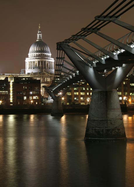
i really wanted to see the original shot, cause i thought that too much photoshop was used to edit the picture, but i was wrong, it's is clear as the original with some color editing.
I like them both- very nice compostion- the lights give a great feel.
I feel teh one you picked for the challenge is better. THe crop makes the scene feel less cluttered and pushed into the corner. trust your instincts. you are the master.
It's interesting - because I'm a purist too, but for me the light pollution over London is impure. My aim on this shot was to present the subject in a way that was more aesthetic - emulating a sky with no ugly neon glow.




 Add photograph to your favorites
 Add photographer to your favorites


 Photographer found comment helpful.


