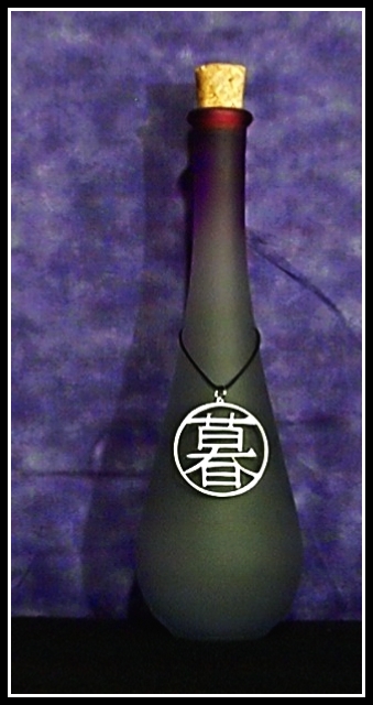
Jewelry I designed with Lisae on a small bottle. I used macro mode. The point of this photo was to try and sell the jewelry. The real point was to work on my focusing with this camera during a studio shot, which is HARD! It just refuses :( I think I have to live with soft focus any studio shots for now.
Statistics
Place: 85 out of 90 Avg (all users): 4.7158 Avg (commenters): 4.5714 Avg (participants): 4.5000 Avg (non-participants): 5.1613 Views since voting: 1323 Votes: 95 Comments: 8 Favorites: 0
Composition/ Content/ Background You’ve already mentioned focus in your own comments, so I am not telling you anything new when I say this image suffers from lack of sharp focus.
I do like the jewellery itself though I’d not know without you telling me that a) it’s jewellery as opposed to a fancy bottle tag and b) that it’s the main focus of the image.
Aspects I find offputting: the bottle does not seem to be entirely vertical within the image; the background would be better curved beneath the bottle to create a seamless background to the image; the colour of the background clashes with the two colours in the bottle; the composition is a little unbalanced – too close to centred to be successful as a non-centred composition but too far from centred to work as a centred composition; because the background is so “busy” I find the shadow on the background more interesting than the foreground object itself.
Camera Work - Technical Focus, as above.
Might be worth playing with lighting – how about secondary lighting through the bottle from behind, what about softer lighting or perhaps harsher lighting providing some highlights off the bottle and jewellery?
Fits The Challenge Not hugely, for me. I think that this would be the kind of thing which a jeweller might commission but would make little sense as a generic addition to a stock library – the jewellery is too prominent for it to be used as a generic bottle of perfume or alcohol.
My Opinion On The Photo Would love to see this retaken with some changes as discussed above.
Annniiiiiiiida... I love what you did with our "live" pendant, but from looking at a lot of the other photos in the challenge so far, I can see that this seems more like an advertisement than a stock photo :/.
This artistic photo is enhanced by the white line in your frame. I feel that the background is a little overbearing, and I don't like the shadow. Not a bad job though. 5






 Add photograph to your favorites
 Add photographer to your favorites

 Photographer found comment helpful.


