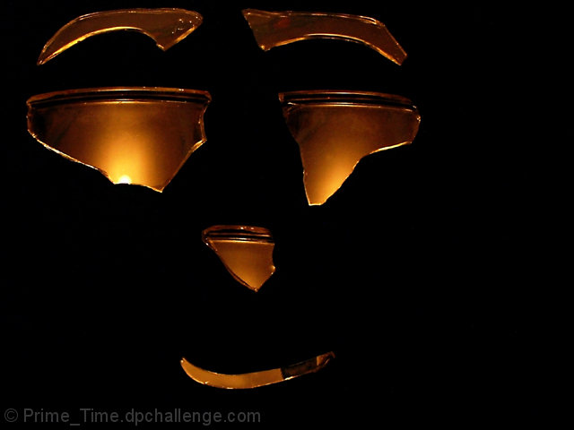
Composition: 6, nothing wrong here. kinda like the negative space
Technical: 5, looks fine
Appeal: 5, doesn't grab me, but doesn't make me want to run away
Challenge: 1, you blew it here...nothing is broken
Overall Calculated Average Score: 4
The black background is well achieved. The set-up, framing, and lighting though need work. There is a kind of bronze quality to the finished shot that I quite like, but overall it's indistinct. The light: well, galss is difficult to light, and is usually more a matter of lighting a background and using the distortion of the shape of the glass to bring its presence to screen. Framing: what looks like an attempt to emply the rule of thirds is difficult when there is nothing here other than the subject - as is, it just looks off centre. The effectively employ the rule of thirds, one needs some context, some surrounding to parallel the main subject, I think. I imagine this side-lit from the left, so that the shadows fall into the negative space area to image right, and a background other than black, and I think you'd have a more dpc-friendly shot.
I just like this. I swear the candle light is flickering. I am a big Halloween (the original movie) fan and this is reminiscent of the opening credits; I can almost hear the eerie music. Very appealing to me for my own personal biases. If people can give 1's based on emotions and personal preferences, I can give a 10 for the same reason.






 Add photograph to your favorites
 Add photographer to your favorites


 Photographer found comment helpful.


