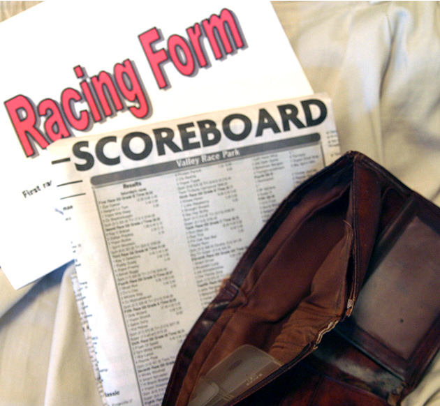
creative interpretation, but i would've liked to see more focus and perhaps could've lost the big 'Racing Form' sheet, as it doesn't look too authentic - maybe some other things in the wallet could make it seem more used (an ID?). either way, good idea.
That's your problem...bet on horses instead. :) The layout could use a lot of improvement. The background doesn't enhance the picture. The main part of the photo, Scoreboard, is way too out of focus.







 Add photograph to your favorites
 Add photographer to your favorites


 Photographer found comment helpful.


