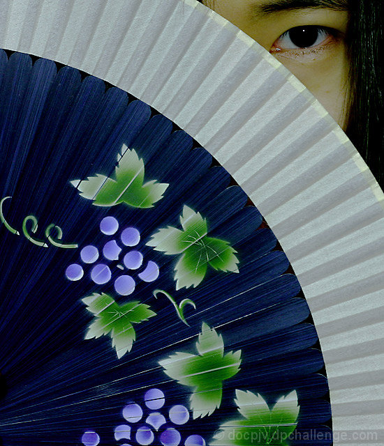
Very interesting composition. In my opinion, this shot would be strengthened by some more dynamic lighting. Right now the lighting is kind of flat and pale- like it was lit with an overhead flourescent light and a weak flash for front lighting. Some ideas that I might try to add some lighting interest to the shot are adding a warm side light aimed at the model but avoiding the fan to increase the dynamic range difference between her face and the fan. Alternatively adding a backlight aimed at the fan might give the same result but in a different way.
Nice job with the framing of this shot. I think it is a very strong composition. Good luck.
Awesome shot! I love the little peek you get at your model! At first I was put off by the greenish cast in the skin tones but after looking at this a moment longer, it really seems to work well! It's kinda tenous to the challenge theme, but still an excellent image!
TC
Although there is no actual wind represented in the I can certainly understand your interpretation. I absolutely love the composition of this picture but I feel it's lacking in brightness and could benefit from some color sarutaion. You've probably gotten slammed for not having "wind" in the picture so I'll be sure not to. - 9
A very appropiate entry which many DPC members will dismiss because they never had reason to appreciate the Fan. Westerners give little weight to the physics inherest in a fan to create wind. Expressions of fanning the flames have been around, but in this age of air conditioning the past is easily overlooked.
Well, my only concern is that the part of the face that shows should have received the ultimate attention to capture the skin tones at the expense of the fan. That is the fan has enough color that you can favor the skin tones and still have enough impressive color on the fan.
The composition is just great and really above average. You do have a flair and I suggest you give yourself enough time to tweak your images. Had the skin tones been up to par I would have given the image an 8. As is you get a 7. I had you in my holding place of 5 and your are being bumped 2 notches.
I love this image soooooo much! The detail and colors, especially the colors, of the fan are excellent. The composition is out of this world, great placement of the eye and person behind the fan. It ijust does not represent wind to me. Oh dear.....well hopefully you won't get that too much, cause this just too perfect to not get a really high mark from me.
Beautiful portrait. Excellent composition. Like the color. Perfect focus used. Implies wind, not showing it, or I would have voted it one spot higher. Well done!







 Add photograph to your favorites
 Add photographer to your favorites

 Photographer found comment helpful.


