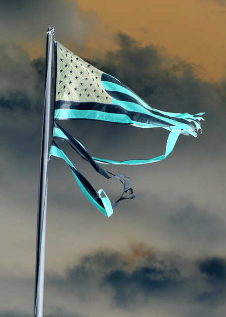
Broken colouration too, is that it? A technically fine shot, although I have a resistance to the subject matter which won't cost you anything - but I have a stronger resistance to the wacky colouring: it makes the flag an unfamiliar thing, and yet your title suggests that it should be an immediately familiar one. Maybe the impression of confusion is one you wanted to sow, but to my mind it is incoherent.
I think you have a great photo here but the post shot adustments (or infrared filter)dont work for me. I think this would be much more of a shot if the flag was normal color.
The flag is a nice shape, good sky. Why are you inverting the image and using this title? What are you trying to say? Is this an effective way to get your message across?
Would have had more of an impact (to me) if you left the flag RW&B. I like the sky in the background but find the saturation of the flag will cause you some higher votes. Still gave a 5 based on the composition (7 if flag was untouched). Would like to see a copy with the flag untouched.




 Add photograph to your favorites
 Add photographer to your favorites


 Photographer found comment helpful.


