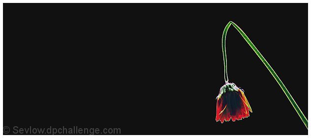
The cropping baffles me here. Why so aggressively horizontal if there's nothing THERE to see? At least in this case, the actual image divides to thirds, not halves, the frame.
really like the compostion and the light areas around the flower's stem (minor nit - white border gives the shot a finished look but takes away from the impact of the image in a way -- perhaps a thinner one??) As presented, one of my ribbon picks this challenge
Nice backlighting, colors and negative space. Says more dead than broken. Good luck. I would like to see a "live" version in your portfolio. Good job and good luck.
Your placement is perfect as is the rim lighting. Truly a piece of art. The white border holds it together very well. It has a lot of negative space - not really sure if that helps it or not. It SHOUTS broken extremely well.
The post processing on this seems a bit much. The back ground doesn't seem to fit quite right. There is also oversharpening halos around the flower. Overall composition is good and the idea behind the shot. The technical post processing however brings the score down. -danny




 Add photograph to your favorites
 Add photographer to your favorites


 Photographer found comment helpful.


