Okay, probably one of many broken window shots, however I didn't want to go through another challenge with the constructive criticism comments (thank you and please continue)followed by "I don't really see how it relates to the challenge." Photography is art and interpretations differ from me to you to the person always standing behind you. I have tried to stretch the meaning of a couple of challenges and will continue to do so going forward (we don't always have to work inside the box). Sorry for the rant (bad day today). Please continue to provide your comments as I do learn and value what each of you have to say.
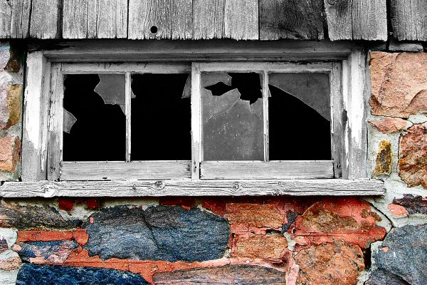
When searching for my entry to this challenge, I tried to focus on weakness or the discontinuous element of broken. I had taken some other shots of rusted gates and older homes (found an erie "condemned" home in neighbouring Courtice which I'm sure I'll venture back to in a future challenge), but decided to go with this simple entry.
In PSP8, adjusted levels. Originally I had only the window and frame desaturated, however did't like the colour in the wood. Decided to desaturate the wood as well. Simple and not very original, however I really like the end result. Hope you do as well.
Thanks for all who voted and especially those who provided comments. Please keep it up as I have learned a great deal in my first 5 challenges.
Cheers!
Statistics
Place: 30 out of 177 Avg (all users): 5.9418 Avg (commenters): 6.1667 Avg (participants): 5.8462 Avg (non-participants): 6.0306 Views since voting: 1183 Views during voting: 273 Votes: 189 Comments: 14 Favorites: 1 (view)
This image had so much potential but fell down a little in the basic composition in my view.
You have great colours and textures in the stone and wood and contrasted well with the jagged edged glass. The image is sharp and the exposure is handled well the subject has a fair bit of intrigue about it and meets the challenge ideally. The desaturation of wood works very well in this image and perhaps we could have seen more of it.
The more I look at it the more it says “central image” this would have helped enormously, I feel that you would have scored much higher if you didn’t crop as tight on the left and tried to center the window frame. I would also like to see more of the wood at the top and less of stone on the bottom and then you would have a much more pleasing to the eye type image.
Congratulations on an image that is very good and scored well but could have scored better.
Interesting desaturation of the wood, OR very kewl weathering. I wish the image were a little looser on the left, I don't like the windowsill being nipped.
Composition: 5, fairly dead on
Technical: 6, while nothing in the shot is out of place, it also doesn't look like it challenged you too much from a technical standpoint
Appeal: 6, i have mixed feelings about the colors. i don't think the desat is particularly effective here. it's not really grabbing me.
Challenge: 8, while the image has broken windows in it, the way you have treated tends to highlight the stonework as the primary subject. as is, the broken glass is competing (and in my opinion, losing) to the wall.
Overall Calculated Average Score: 6, the one thing that makes this above average for me is the textures that you've captured. good luck!
Not sure what the selective desat. achieves here as the image by intself is attractive enough. Perhaps if you had left the colour in the wood above the window it might have balanced it out.
Lots to like about this pic, but the composition, or lack of it, is the first problem i see. It is a snapshot of a broken window (an excellent one, technically speaking), but lacks interest.
Nice colour and mood. I don't really like the way the bottom of the frame (the sill?) has been cropped off on the left side of the photo. The subject and colour have potential but the picture is not yet interesting. I would be tempted to have zoomed out and made the window less overbearing.






 Add photograph to your favorites
 Add photographer to your favorites

 Photographer found comment helpful.


