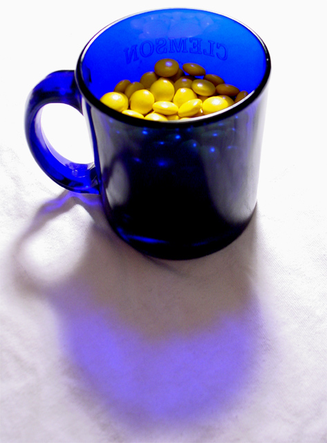
Translucent blue coffee cup (yes, it is a Clemson cup - thanks for noticing) with yellow Reece's pieces in it. Two 14oz bags only yield this many yellow pieces. I had some yellow pieces "spilled" out of the cup, but I couldn't get the exposure/contrast right. The background is white t-shirts
Statistics
Place: 109 out of 252 Avg (all users): 5.2829 Avg (commenters): 5.1111 Avg (participants): 5.1929 Avg (non-participants): 5.4769 Views since voting: 1160 Votes: 205 Comments: 11 Favorites: 0
I saw you comment about feedback from the CC club, so I thought I'd come back and give you some thoughts.
I generally rate photos giving a score from 0 to 3 each in terms of originality, meeting the challenge, and quality. Those add up to a 9, and a 10 is something that blows me away.
For yours, I thought that the originality was okay, and it did meet the subject, but where you were hurt the most was the quality. In your case its not that the photo was out of focus or any way you could have manipulated your camera to get a better result, but the setup really bothered me that the sheet was visible at all. I've found that its not that hard to take those shots where the objects seem to 'float' over a black or white background that provides no distraction from the subject and focus of the picture, and to set up a shot that doesn't do that pushes the needle to the amateur side of the 'quality' rating. A couple of months ago I went to an art store a for a couple of bucks bought some 18x18 thin black and white boards that when used can make the photo, IMHO, look more professional (like here). I also didn't like the shadow on the top part of the yellow candies. Maybe the lighting could have been a little better controlled and/or you could have filled the cup up a little more to avoid that.
Your concept of yellow works very well in this photo. I didn't interpret the challenge as 'see how much yellow you can stuff into one photo' :) I believe I see what you were trying to achieve here with the back lighting and the blue shadow, but the composition feels a bit awkward to me. I don't really know of a better way to achieve what you did here.
Having the cup so far up in the frame seems to 'cramp' the cup and not allow it any breathing room. In an image like this, My mind wants to stick my hand in the cup and snag some candy. There isn't much room for that in the frame so it presents a sort of barrier to the viewer maybe.
I can't really offer much for improvement other than these things. The exposure may be just a little on the hot side though.
Creative idea - I like the contrast between the blue and the yellow. The cups handle is too soft, and while focus looks good on the yellow ?smarties?, the light reflecting off them is a little bright.
There is plenty of contrast and your decision to light the mug from behind - and make it glow - was definitely a good one. I might have left a little more whitespace above the mug (ie: cropped less at the top).
Great shot, contrast and colors; the only thing I would try to change if you could somehow diminish the lettering on the far side of the cup as it is a bit distracting. Good job!





 Add photograph to your favorites
 Add photographer to your favorites

 Photographer found comment helpful.


