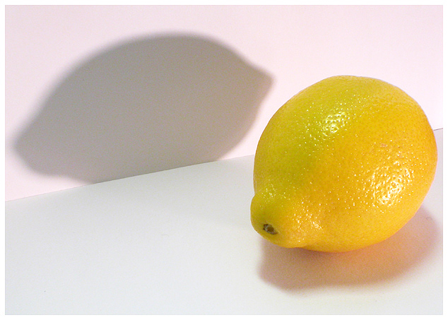
When I studied this photo for a while I realized that something was bothering me a little. It is the larger shadow and the lemon having the same visual weight. This causes my eyes to continuously wander back and forth between them without actually resting at any particular place. I think I would have liked it better if the scene were rotated slightly to the right so that the lemon was larger in the foreground and slightly overlapped the larger shadow. This would enforce the perspective and allow the lemon to be the more dominant element. I also don't really like the way the shadow is cut off on the bottom.
The colors are rich and clean. You chose a very nice lemon. I'm a little unsure of the pink color in the background but it does suggest pink lemonaide so I guess it works well enough. The lighting could use some more contrast to make it a little more interesting.
It is such a simple image that there is not too many elements to comment on but that's not a bad thing. Great images are often very simple in their elements. This photo has many things going for it like nice colors, interesting shapes and lines and cleanily executed. I just think it needs a few adjustments, mainly to the composition, to make it even more striking.
Nice image. It is very clear and colorful. The white background and the shadow of the lemon make the picture turn out very nicely and it is very attractive to the eye. Good job.
This is very interesting and a creative take of many of the lemons I have seen in this challenge. Hoever half of the lemon appears to have a greee tinge...other times this might not be a big deal, but this challenge is all about the color...overall I like the creative message here.






 Add photograph to your favorites
 Add photographer to your favorites


